The Dutch National Institute for Public Health and
the Environment (RIVM)
and the National Foundation for Intensive Care
Evaluation (Stichting NICE)
collect almost in real time a plethora of data.
The Dutch financial times asked me to make early
calculations, and monitor the important rates every
day. We used RIVM's and NICE's data to explore the potential
effects of measures taken by the Dutch government,
to predict peaks and thresholds.
The Fourth wave
The second week of February, 2021 a fourth wave started without a stagnating period. On April 20, 2021 Dutch government announced that a week later (April, 28) the Netherlands will be opened up bit-by-bit. The reason they give is that infections, hospitalization, and ICU-hospitalization has leveled the past two weeks. Below we carry out daily tail analyses to investigate whether or not there are indeed trends in the infections, hospitalization, and ICU-hospitalization: so is there an increase, decline or stagnation? Next to that, Dutch vaccinations are in progress and each and every country has its own vaccination strategy. Different strategies are compared by way of output: ho wmany vaccins are administered. We also look at Israel's output. Moreover, vaccination speed of various countries is analysed.
Below the fourth wave in the Netherlands is analysed using similar
methods that we used earlier, see below for
mathematical details.
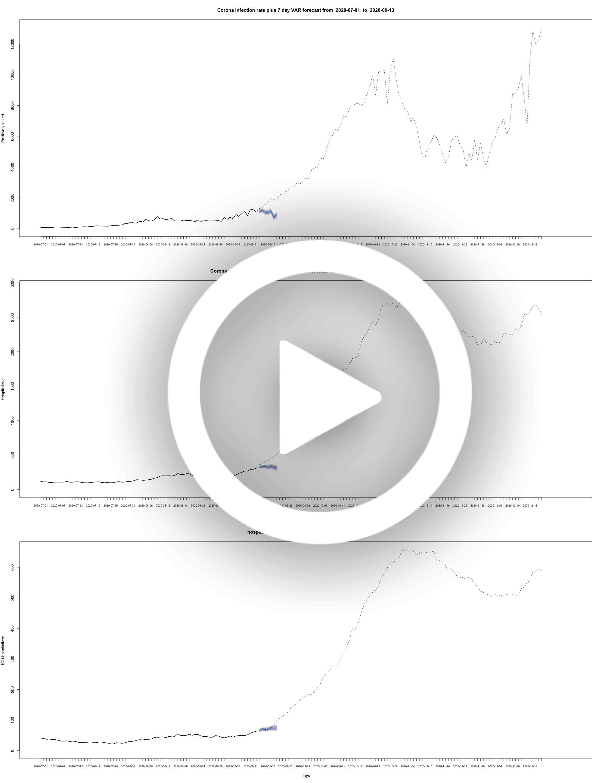
Daily rate of positively tested COVID-19 patients plus some models

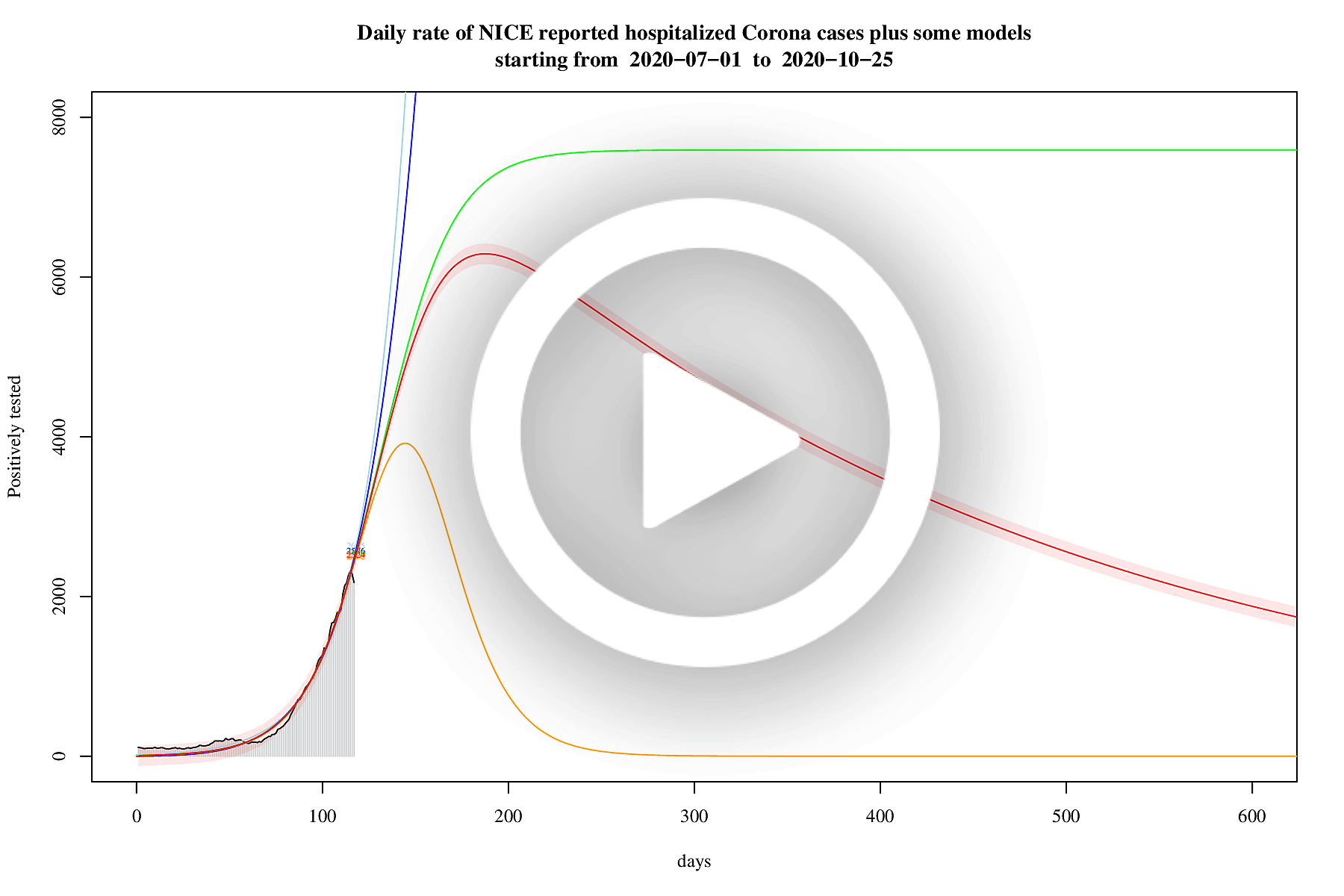
Daily rate of hospitalized COVID-19 patients plus some models

Daily rate of ICU-hospitalized COVID-19 patients plus some models

SEIR modelling of the fourth wave
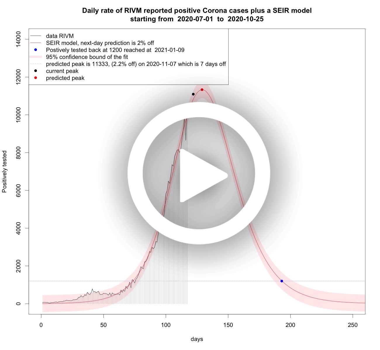
In this section, only SEIR models are used, and every day all models are fitted again on all dates. The reason is that recent values are often corrected to the latest knowledge.Daily rate of positively tested COVID-19 patients plus SEIR models

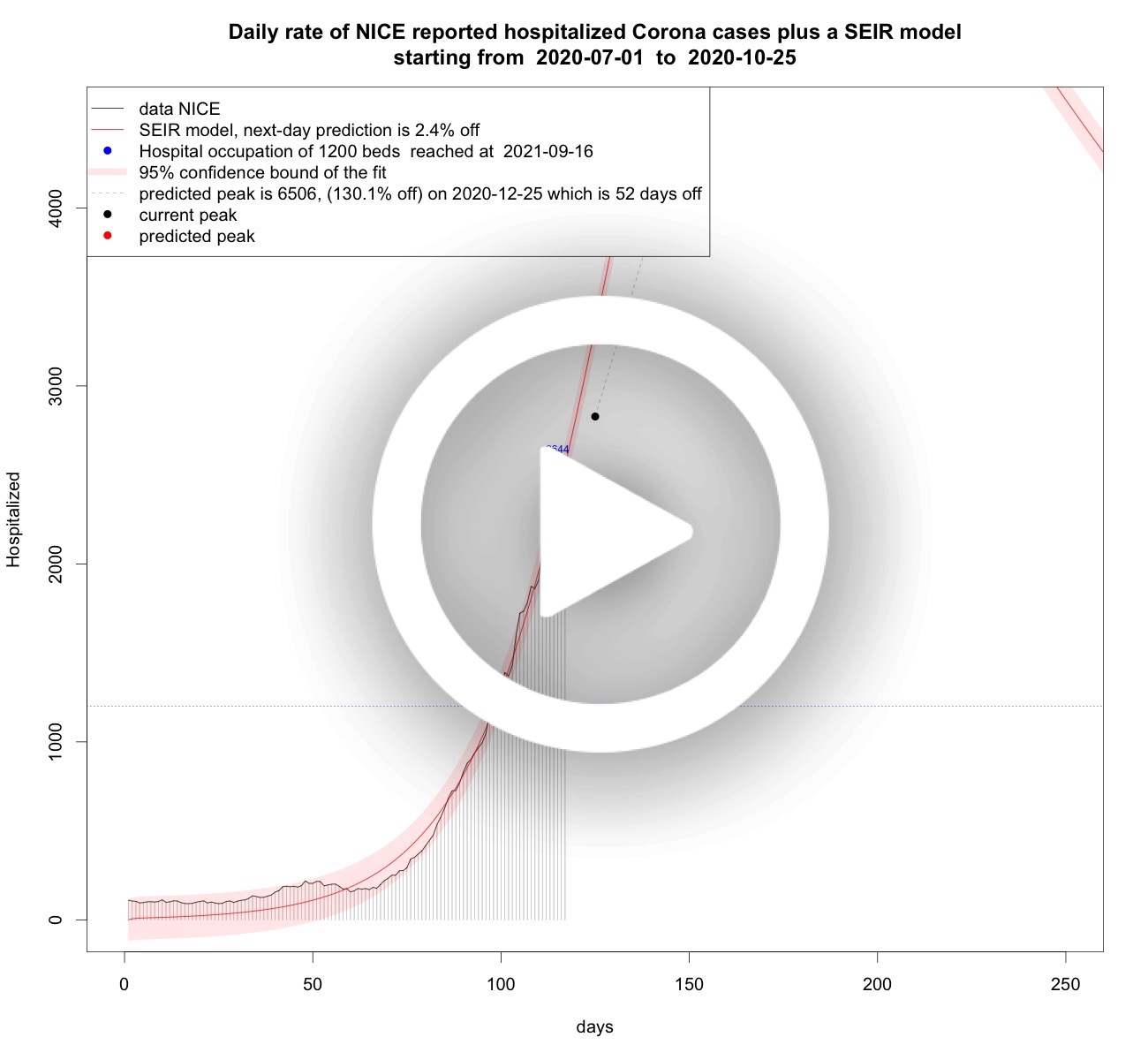
Daily rate of hospitalized COVID-19 patients plus SEIR models

Daily rate of ICU-hospitalized COVID-19 patients plus SEIR models

Vaccination strategies
In the Netherlands there is a lot of criticism on the vaccination strategy. It is too slow, it started too late, organisation is chaos, etc. In data science we sometimes say: it never pays to think unless you run out of data. Thankfully, there is plenty vaccination data, and so we can compare the number of vaccinations administered over time in the Netherlands to other countries. The amount of vaccinations over time is the result of their strategy (if any at all). So, let's stop thinking and just look at the data and then try to interpret what we see.France and Dutch vaccinations over time

Belgian and Dutch vaccinations over time

German and Dutch vaccinations over time

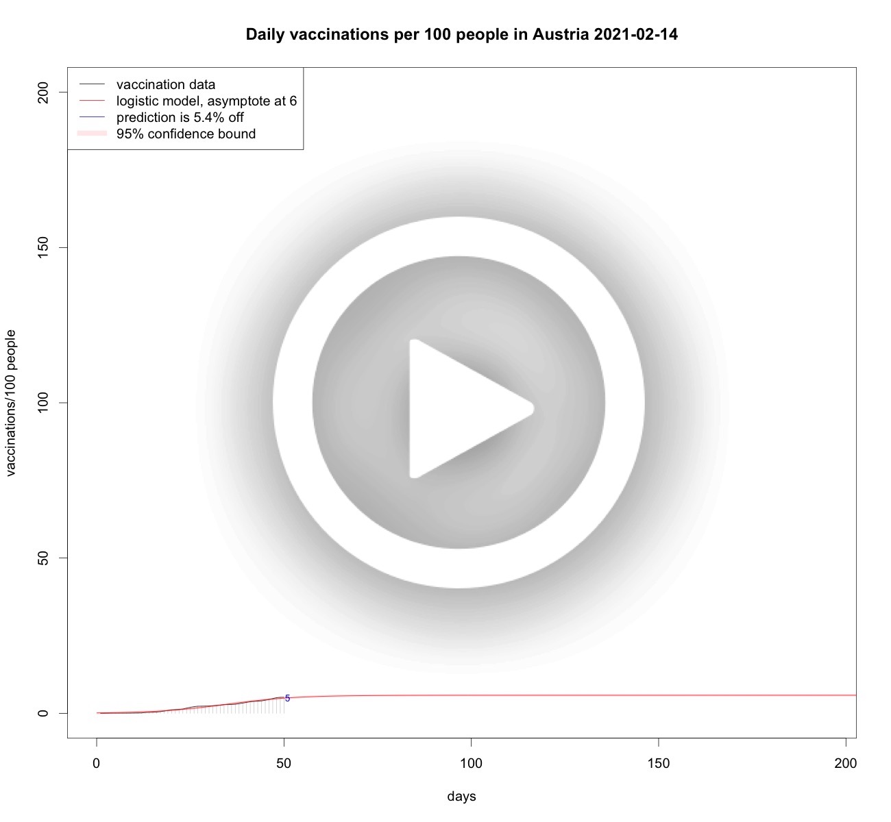
Austrian and Dutch vaccinations over time

Swedish and Dutch vaccinations over time

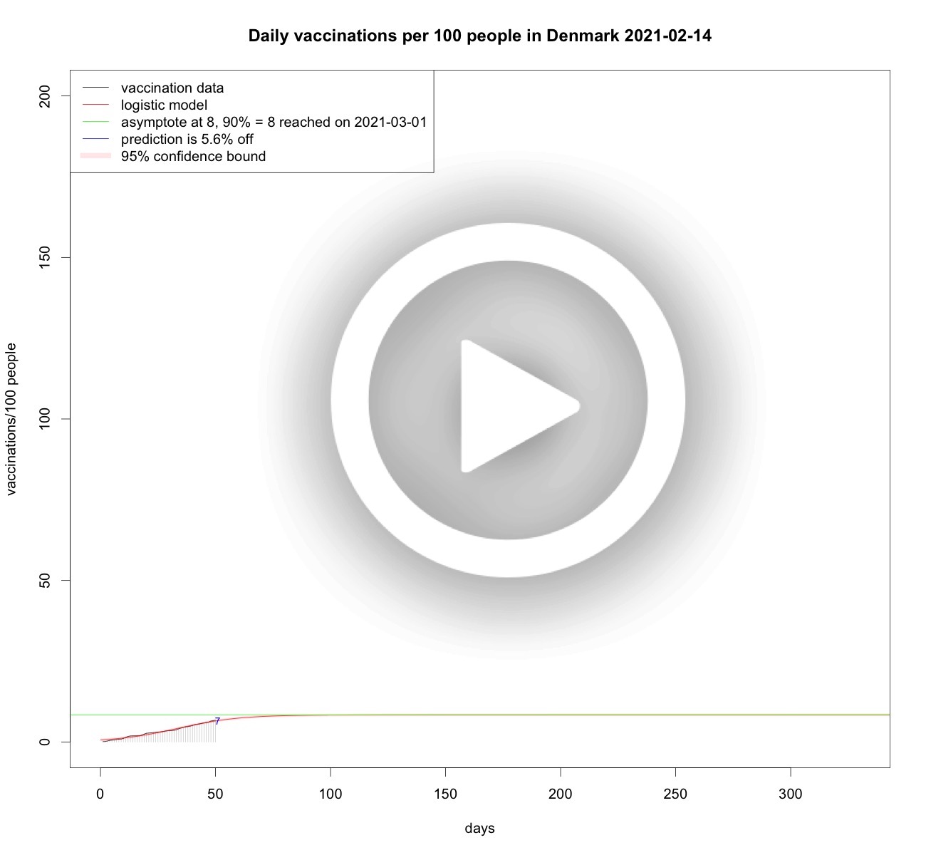
Danish and Dutch vaccinations over time

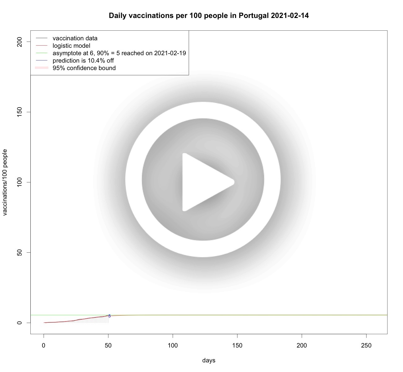
Portugese and Dutch vaccinations over time

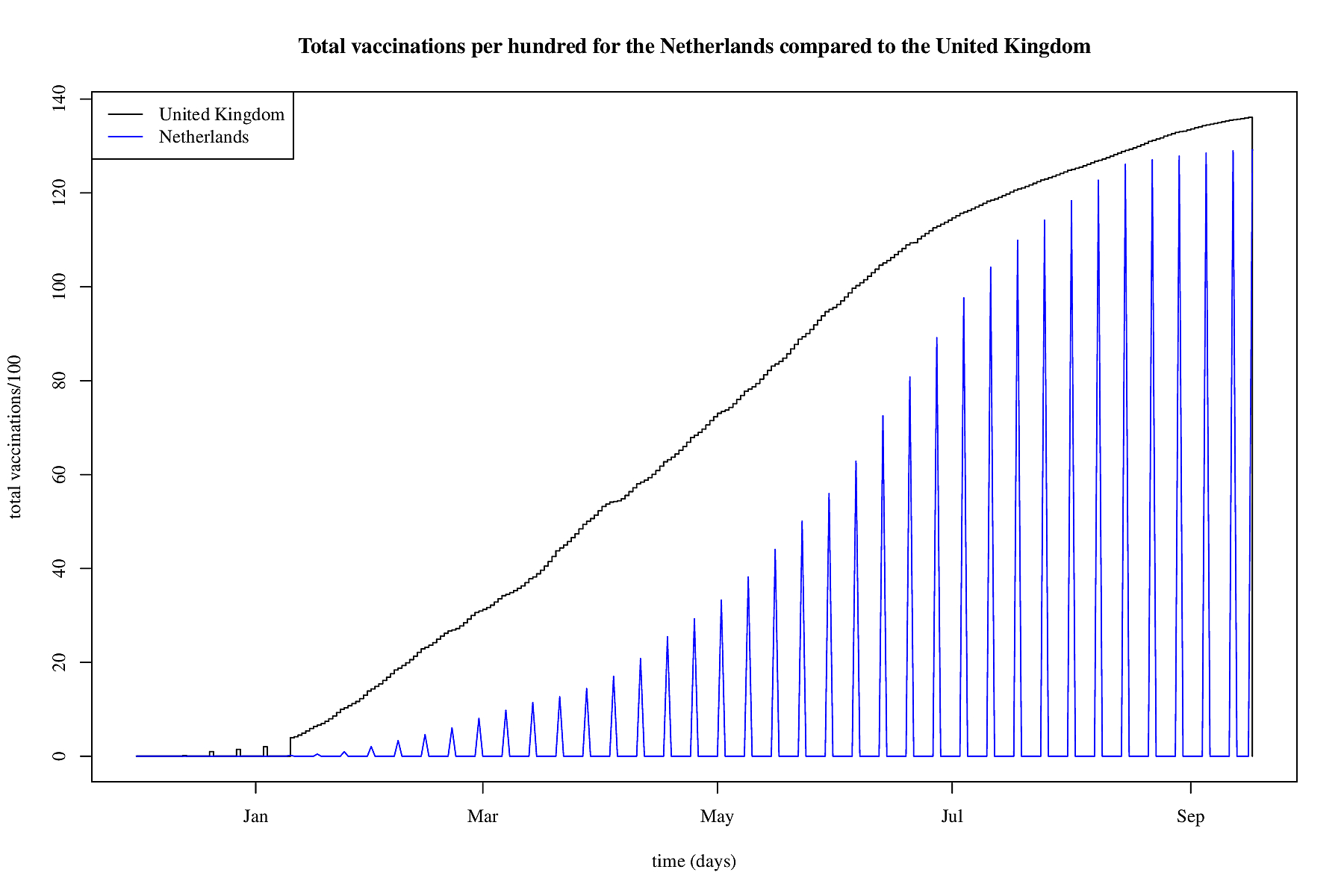
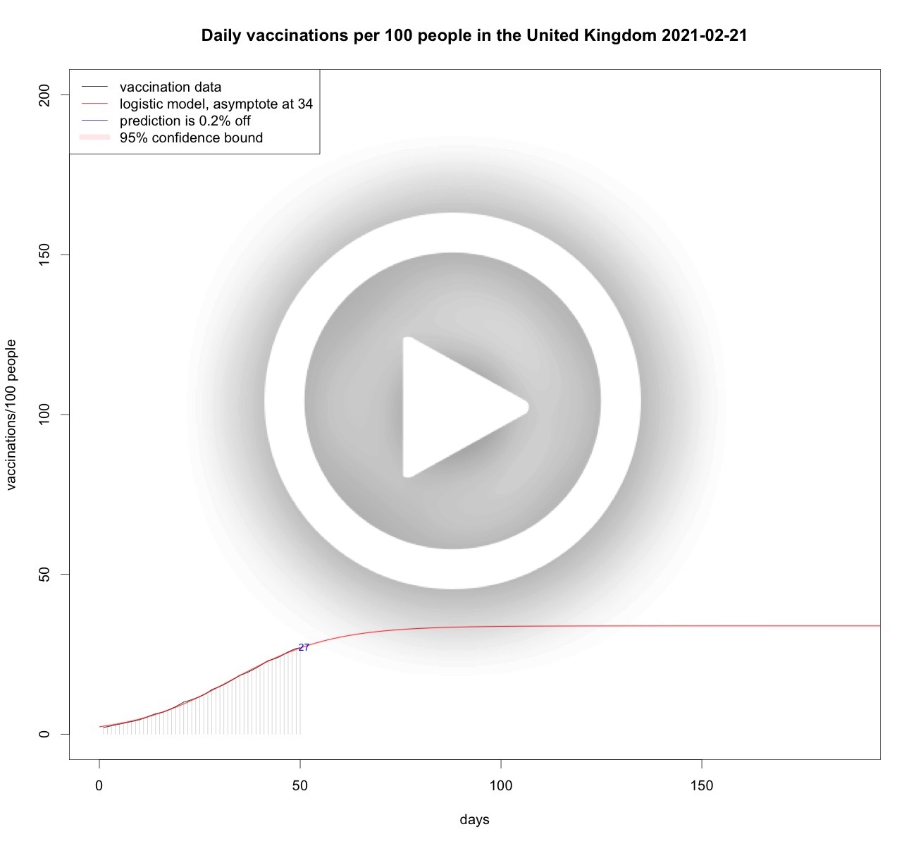
UK and Dutch vaccinations over time
US and Dutch vaccinations over time

Israeli and Dutch vaccinations over time

Note that Israel is giving booster vaccins, so a third jab, this is only a limited effect on the full vaccinations, but there is some effect though.

So, looking at the above data points it seems that vaccination speed is determined by two important factors. First, the amount of vaccins a country can get its hands on; this causes stagnations at the start. And second, the eagerness for the public to actually get vaccinated; this causes stagnations at the end. Since even in a country where there's plenty (Pfizer) vaccins there's a stagnation. So, let's look at vaccination speed and try to predict that based on the available vaccination data.
Vaccination speed
From the data analyses above it is clear that the growth of vaccinations per 100 people is somehow limited, be it by scarcity, willingness, or other factors. So it makes sense to model vaccination speed as a limited growth phenomenon. Therefore, using logistic curves, or S-curves is sensible. Each day when new vaccination data becomes available the analyses are updated to the latest available data. Below some analyses.Total vaccinations per 100 people in the Netherlands

Total vaccinations per 100 people in France
Total vaccinations per 100 people in Belgium
Total vaccinations per 100 people in Germany
Total vaccinations per 100 people in Sweden

Total vaccinations per 100 people in Denmark
Total vaccinations per 100 people in Austria
Total vaccinations per 100 people in the United Kingdom
Total vaccinations per 100 people in the United States

Total vaccinations per 100 people in Portugal
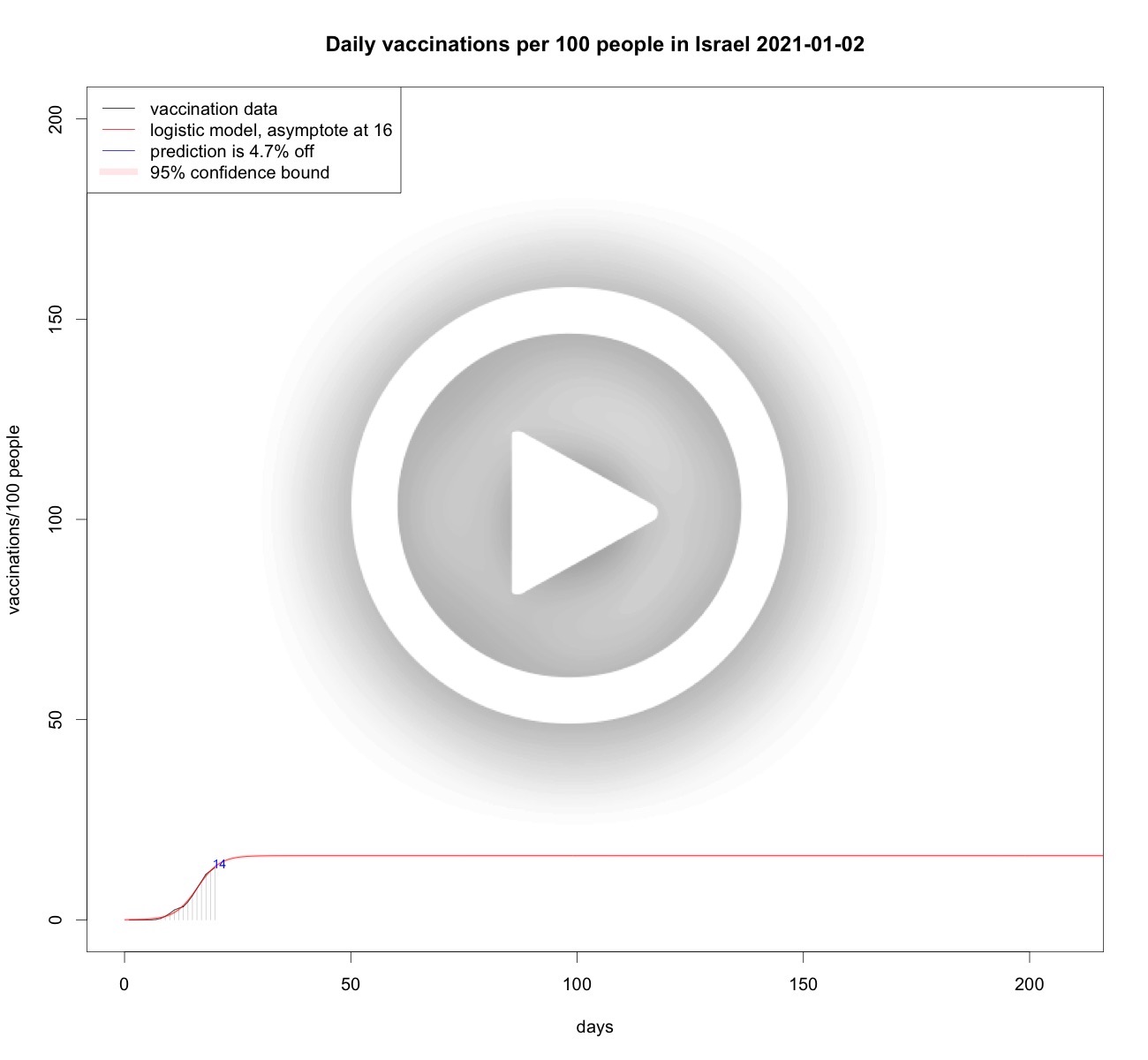
Total vaccinations per 100 people in Israel
Total vaccinations per 100 people in Gibraltar

Preventive measures
All countries take preventive measures, and the question is what is their effect. As mobility leads to infections, many measures are intended to curb mobility. Below a number of countries' mobility trends compared to the Netherlands.France versus the Netherlands
In France there are signs that the curfew is not working as expected. In the Netherlands a curfew is in place as of January 23, 2021. To obtain an idea of the behaviour of France versus the Netherlands, Google and Apple mobility trends are plotted for both countries and the start of both country's lockdown and curfew measures are plotted as well.
The solid black lines are the two French trends: the one in the upper half is Apple mobility and the one below is Google mobility. See below how these are aggregated. The blue solid lines represent the Dutch mobility trends. The vertical black dotted lines are the start-dates for lockdowns in France, the blue dotted lines represent the Dutch start of both lockdowns. Finally, the red and green dotted lines signify the start of the French and Dutch curfews.
The general view is that in France the lockdown comes from a higher mobility and drops to a lower one than the Dutch lockdowns. It is also visible that in France the rise of both mobility trends is sooner higher than the Dutch rise. Indeed, mobility after the red dotted line does not show any drop, but the second lockdown does (with a typical pre-lockdown peak, as we had in the Netherlands on dec 14, 2020). Compared to the Netherlands, the decrease in mobility is much slower but more steady: when the second lockdwon in the Netherlands starts (see blue dotted line), the mobility in France is already rising above the Dutch mobility trends. It seems that during the first lockdowns, the French are lower and during the second lockdowns the Dutch have lower mobility. So, looking at the data and given the direct correlation between mobility and virulence (see below) one can say that the French are right in that their curfew is not helping that much. But their lockdowns are. It is relatively good news that in the Netherlands the mobility after the second lockdown is at least lower than in France. Hopefully, in the Netherlands the extra measure of the curfew is working out a bit better than in France, as it will potentially lower the reproduction number of the virus.
Belgium versus the Netherlands
There were some signs in the media that the curfew in Belgium seems to be working. So a similar analysis is made as for France.
There is a striking resemblance again with the drop in mobility during the first wave in March 2020. Both Google mobility trends are similar, but for Apple mobility Belgium dives even deeper than the Netherlands. The red dotted line signifies a curfew in Belgium and Google mobility drops in a staricasing fashion, but it drops. Then when the Belgian lockdown starts Google mobility does not lower any further but it doesn't increase either. After some time the Belgian mobility trend creeps up. The Dutch mobility trend by Google is lower than the Belgian one, and after the Dutch lockdown it seems to be a bit lower, but below we can see that this is not signifcant as a trend. The relatively good news is that it stays low, and the curfew (green dotted line) does not show a change. Starting from the Belgian curfew, Apple mobility of both countries is comparable.
Austria versus the Netherlands
I got a request to also look into Austria since that country might be comparable to the Netherlands in taking measures in the same order.
As with France and Belgium is is again striking to see the drop in mobility in March 2020. The unknown virus presumably caused some anticipatory anxiety and the majority abided by the rules. Both the curfew and second lockdowns in both countries did not show a severe drop in mobility. In Austria a third lockdown did show a drop but it was precluded by a pre-lockdown peak as we have seen in the Netherlands as well for the second lockdown on December 14, 2020. This 14the December peak is best seen below when compared to the reproduction number.
Germany versus the Netherlands
The media reported that German government officials worked on creating extra fear to make people follow the Corona restrictions. So a comparison in mobility between Germany and the Netherlands has also been made.
From the plot it is clear that the mobility trends of Germany and the Netherlands are quite comparable. So whether or not the FUD-principle has been used or not, no real deviations can be detected, neither in the first wave or later on. In fact, the drop in mobility looks pretty much the same for other countries as well. So, apparently the Germans were as obidient as other countries.
UK versus the Netherlands
The media reported that the UK and the Nehterlands took a lot of measures in concert, whereas other countries do not. Is the mobility comparable to the Netherlands? So a comparison in mobility between the UK and the Netherlands has also been made.
From the plot it is clear that the mobility trend of the UK performs similar or a bit better than the Netherlands. It is not that easy to understand the chronology of the UK-interventions, because there were also regional measures. A few of the national measures are plotted as vertical black dotted lines. In all three cases a significant drop in mobility trends is present, which means the measures do have a positive effect on lowering mobility.
The British mutant
Jan 20, 2021 almost all prognoses for the infections, hospitalisation and ICU-hospitalization show declines. Also the tails of the time series have strongly significant lowering trends. So it is not a coincidence that the rates are decreasing. Even the reproduction number is a bit below 1, nd if it syays that way the epidemic wil eventually die out. In the Netherlands the British mutation of the Coronavirus has been found and recently the estimates are that 10% of the cases are already the mutation. From recent Britisch research the estimate is that the reproduction number of this variant is between 0.4 and 0.7 higher. That implies that even though the reproduction number is a bit below 1 at the moment, this will change with the upsurge of the British variant. So extra measures are needed to cap a fourth wave. Jan 23, 2021 a curfew (avondklok in Dutch) is in place, and one might wonder whether this helps at all. In fact, it is not that hard to imagine: less mobility means less spread of the virus. In fact, there is a very strong correlation between a drop in mobility and a drop in the spread.
In this figure the reproduction number of time is plotted in purple with pink confidence bounds. In green the sum of all apple mobility trends is morphed on the reproduction time series by a rescaling operation. The same is done with the sum of all Google mobility trends (except mobility in parks, see below), and also that trend is rescaled so that is fits nicely on the reproduction number scale. In blue dotted lines both starts of both lock-downs in the Netherlands are positioned. The black line is where the reproduction number equals 1 and that is the number we need to be under. It is striking that at the start of the first lockdown both mobility trends dropped and in reaction to this the reproduction number also dropped significantly. At the second lockdown the mobility trends did not drop that much, and also the reproduction number did not drop that much. The reproduction nuber will increase due to the upsurge of the British mutation, and therefore a further, or should I say true, drop in mobility is needed, and that will inevitably cause a drop in the reproduction number.
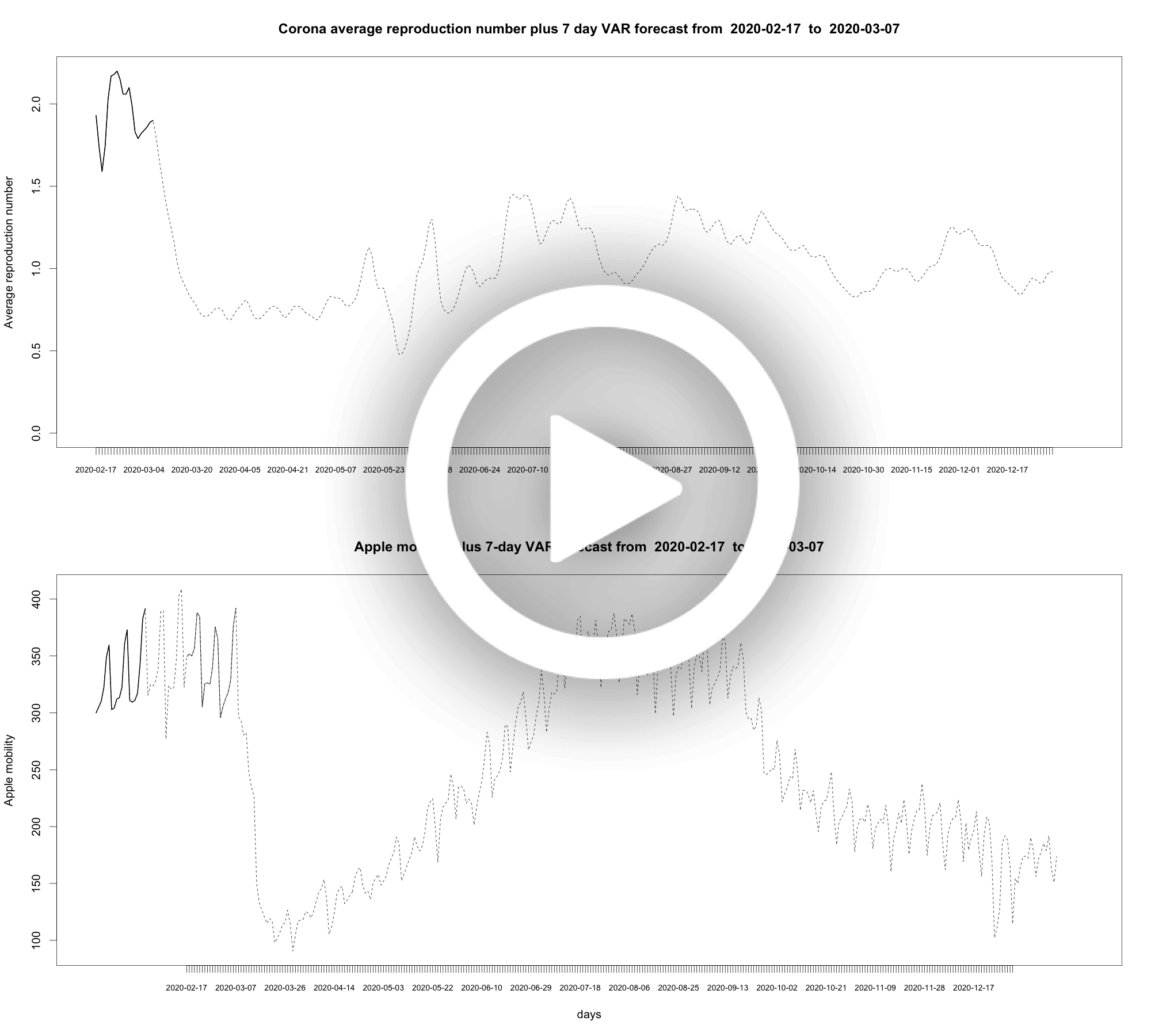
The Reproduction Number R
You can approximate the effective R in a rather simple manner. In brief: the reproduction number represents the 4-day growth of the virus, where 4 days is the amount of days it takes to give the virus to a new victim (generation time). And 4 days is a reasonable assumption, BTW. So, if you calculate the growth per day, you have all the information to approximate the reproduction number. For the Netherlands it is senseless to do so since it is published by RIVM. We illustrate the quality of the simple approximation by the graph below.
In black we see the RIVM published R over time. In red a simple approximation that is using the RIVM data to obtain the optimal fit which is slightly better than the approximation but not that much better: 4-days become 3.75 days more or less. In transparant red is the confidence interval for one standard deviation of the found fit versus the data. As can be clearly seen, the approximation is of sufficient quality to observe trends, albeit that in the Netherlands this is not necessary given reproduction data published by RIVM. For other countries we can easily make the same calculation, and compare that to the Dutch case. Next, some reproduction numbers are approximated and compared to the approximation of the Netherlands.
Reproduction number of France and the Netherlands

Reproduction number of Belgium and the Netherlands

Reproduction number of Austria and the Netherlands

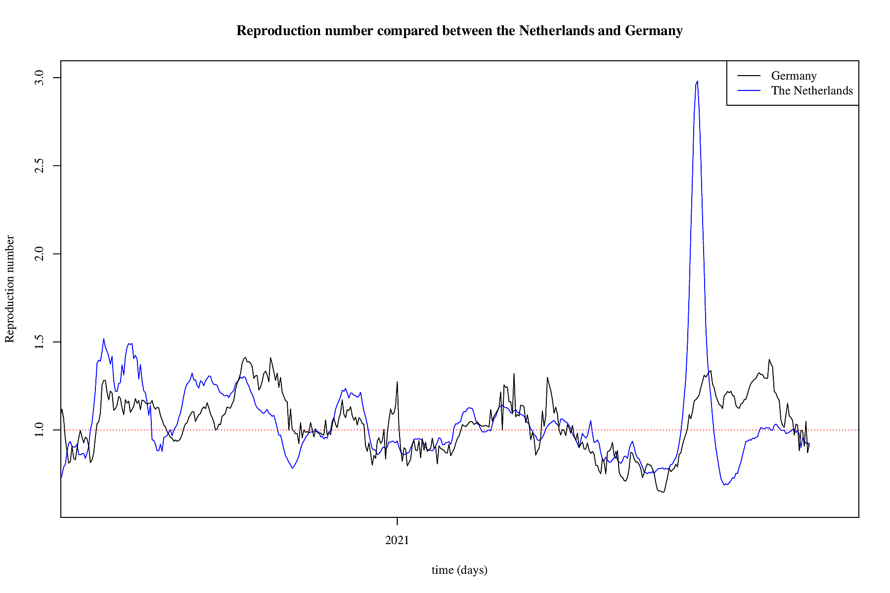
Reproduction number of Germany and the Netherlands
Reproduction number of the UK and the Netherlands

Reproduction number of the United States and the Netherlands

Reproduction number of Israel and the Netherlands

Reproduction number of various countries and the Netherlands

The third wave
December 1, 2020 it seems a third wave started after a stagnating period. As of December 31, 2020 some exploratory analyses are made. Below the third wave is analysed using the same methods as were used earlier, see below for explanations.Daily rate of positively tested COVID-19 patients plus some models

Daily rate of hospitalized COVID-19 patients plus some models

Daily rate of ICU-hospitalized COVID-19 patients plus some models

Tail modelling of the third wave
Daily rate of positively tested COVID-19 patients plus SEIR models

Daily rate of hospitalized COVID-19 patients plus SEIR models

Daily rate of ICU-hospitalized COVID-19 patients plus SEIR models

The second wave
July 1, 2020 appeared to be the start of a second wave of the Coronavirus. Five models are used to assess the effect of the measures taken by the Dutch government. They are:- exponential, in light blue
- flattened exponential, in blue
- logistic, in green
- sech-square, in orange
- SEIR, in red plus confidentiality bounds in light red
Logistic growth is associated with limited growth, and modelling the data on a logistic curve serves the purpose of measuring whether the growth enters the stage of limited growth or not. The better the models fit, and the more we approach the inflection point of the S-curve, the more support it gives that limited growth is imminent or reached. This model is not going to predicte perfectly in the long run, but it signals the start of measures beginning to take effect.
The sech-square model is in fact a trick. It is known already for a long time that the I-rate of a simple SIR virus can be approximated by the square of a hyperbolic secant of a linear function. For instance, in the original paper from 1927 on SIR-modelling of a virus by Kermack and McKendrick, they illustrated that this model is an approximation of one of the rates. They used Ross' data for modeling the death rate for the plague in the island of Bombay around 1905/1906, as seen in the figure below based on Ross' data.

The sech-square model serves the purpose of finding a peak time and peak height in an early stage and looking at both their trends over time to assess whether the peak will come sooner or later and is going to be higher or lower. The square of the hyperbolic secant is a symmetrical function, so this SIR-approximation forces at some point a decrease in the rates. This forced decrease can be compared to other models that do not have a forced decrease to assess their difference in heavy-tailedness.
Which brings us to the last model: the I-rate of a SEIR model. It is useful to compare the sech-square approximation with a SEIR model which is not forced to decrease and if it does also not in a symmetrical fashion. For, the measures taken are intended initially to lower the peak height and to shorten the growth phase. But peak height is not the whole story: this wave also has a period, say its width or wavelength. Taking additional measures as is done in the Netherlands after the intial measures can help to crop the wave length, i.e., shorten its period. The first wave's peak is presumably twice as high, and its period relatively short. For this second wave the peak is much lower, but its wavelength might be much longer. So during a high wave the pressure on health-care translates into not enough beds and personnel whereas during a long wave the pressure on the healthcare system causes a shortage of personnel in the longer term. Thus not enough possibilities for regular health-care, and maybe even casualties because of it. So, extra measures are maybe nonintuitive but seem wise, if, of course, the taken measures resort the desired effects. A potential signal for measuring that is that over time the heavy-tailedness of the SEIR models disappear and the difference with the sech-square model becomes small, and hopefully the SEIR model will move to the left of it. Below the rates with each the above models fitted on them. They are: the infection rate, the hospitalization rate (including ICUs), the ICU-hospitalization rate, and the death rate.
Daily rate of positively tested COVID-19 patients plus some models

As of november 29, 2020 both expontential models and the logistic model are left out for the infection rate, the effect of the falling hockey-sticks is manifest in the animation but its use is gone. Also the logistic model has done its work for now.
Starting January 5, 2021 it is no longer necessary to analyse this data any longer: the analysis shows that there is bad news, namely a third wave. As the second wave is superseded by a third wave this third wave is analysed in the chapter above called "the third wave".
Daily rate of hospitalized COVID-19 patients plus some models
Starting January 5, 2021 it is no longer necessary to analyse this data any longer: the analysis shows that there is bad news, namely a third wave. As the second wave is superseded by a third wave this third wave is analysed in the chapter above called "the third wave".
Daily rate of ICU-hospitalized COVID-19 patients plus some models

Starting January 5, 2021 it is no longer necessary to analyse this data any longer: the analysis shows that there is bad news, namely a third wave. As the second wave is superseded by a third wave this third wave is analysed in the chapter above called "the third wave".
Daily rate of deceased COVID-19 patients plus some models

Cumulative daily rate of deceased COVID-19 patients plus a logistic model

Tail modelling
On november 10, 2020 peaks for positively tested patients, hospitalized patients, and ICU-hospitalized patients have been reached or approaching. So now it becomes important to asses the decrease. For that we only use SEIR modelling, although other models are still used as well to measure the SEIR fit with respect to the SIR-approximation. Following are three animations that try to fit some SEIR model on the data known to a certain date and using animations it is possible to follow their form and hopefully the models show a decrease and show that heavy tails become small tails (as was also happening in the first wave, see below).Daily rate of positively tested COVID-19 patients plus SEIR models
Starting January 5, 2021 it is no longer necessary to analyse this data any longer: the analysis shows that there is bad news, namely a third wave. As the second wave is superseded by a third wave this third wave is analysed in the chapter above called "the third wave".
Daily rate of hospitalized COVID-19 patients plus SEIR models
Starting January 5, 2021 it is no longer necessary to analyse this data any longer: the analysis shows that there is bad news, namely a third wave. As the second wave is superseded by a third wave this third wave is analysed in the chapter above called "the third wave".
Daily rate of ICU-hospitalized COVID-19 patients plus SEIR models

Starting January 5, 2021 it is no longer necessary to analyse this data any longer: the analysis shows that there is bad news, namely a third wave. As the second wave is superseded by a third wave this third wave is analysed in the chapter above called "the third wave".
Dealing with noise
To obtain an idea of the potential systematics in the noise of the infection rate, appropriate ARIMA models have been fitted on the infection rate plus a seven day forecast in blue; the dark grey area being the 80% confidentiality interval of those forecasts and the lightgrey area is the 95% confidentiality. An ARIMA model typically also models the systematics in the noise, if any. Most of the times the short-term forecasts are within the confidentiality bounds. Of course, a simple short-term linear extrapolation will score high as well, so that is not too big an accomplishment. It is interesting to see how this family of phenomenological models tries to see a system in the noisy data. Right after the zig-zag top, the model takes that into account and briefly becomes seasonal. When the data decreases the models do not believe it and predict small increases until the moment of stagnation when the model predicts a further strong decline; just as the virus models. The tail is interesting as the confidentiality bounds keep relatively in line with the bounds of the historical data, and no sign of decrease is present in the model.Daily rate of positively tested COVID-19 patients plus ARIMA models

Tails of infection rates, hospitalization and ICU rates
To see trends early we carry out trend analyses below.Tail of daily infection rate plus trend modelling

Tail of daily hospitalisation rate plus trend modelling

Tail of daily ICU-hospitalisation rate plus trend modelling

Mobility trends
Today, dec 20, 2020 all the signs direct towards a third wave in the Netherlands. There are upward trends in the tails of the infections, the hospitalisation and the ICU-hospitalisation. And the maximal amount of positive cases of the second wave on 2020-10-30 with 11083 cases moved to 2020-12-20 with 13066 cases. As a consequence, the SEIR models taking the second wave into account are now predicting it takes forever to reach the level of 1200 infections per day. The measures taken by the Dutch government will hopfully change the figures in due time. In the mean time, due to the extra peak the predictive power of SEIR models and other models taking the second wave into account will only give us a long-term negative perspective. But we know that this will not last.
A lockdown is effective as of december 15, 2020. Typically, a
lockdown is mean to prevent mobility. And mobility seems to be
correlated to the spread of the virus. More mobility means more
infections, and more infections mean more hospitalisation, and more
hospitalisation means more ICU-hospitalisation. And that means
more people dying of Corona.
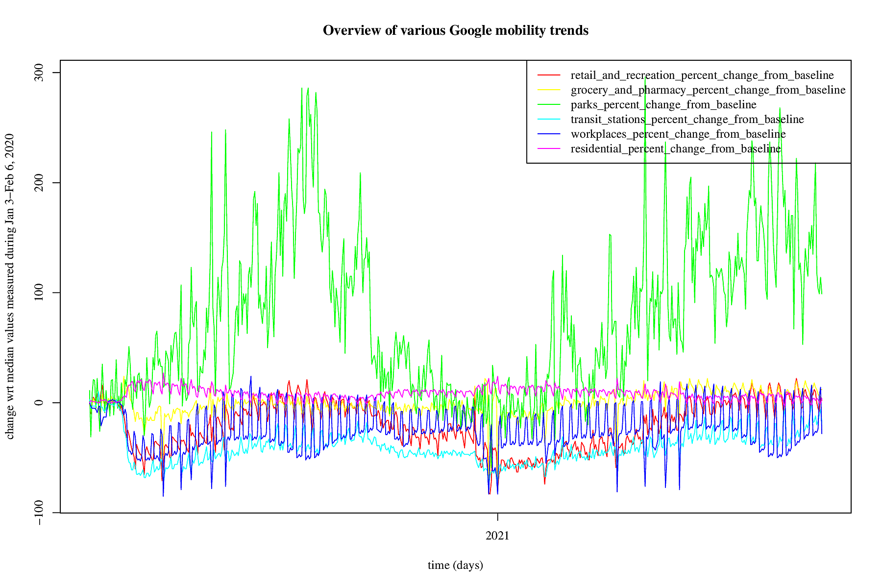
Mobility is being measured by, e.g., Google in their mobility trends.
The trends are a percentage of change with respect to the median
values measured between Jan 3-Feb 6, 2020. For the Netherlands a
picture is made of the mobility starting February 15, 2020. The
data is always a few days delayed. The green line represent trends
"for places like local parks, national parks, public beaches,
marinas, dog parks, plazas, and public gardens" according to Google.
This green line fluctuates a lot and it is not clear whether that
is because of the jardstick that is being used: as in January/February
people tend not to overcrowd beaches, but additionally it seems
that infections in park-like situations are uncommon. For now we
remove the park trends from our analyses (but by way of checks they
are carried out, just not put on the website).
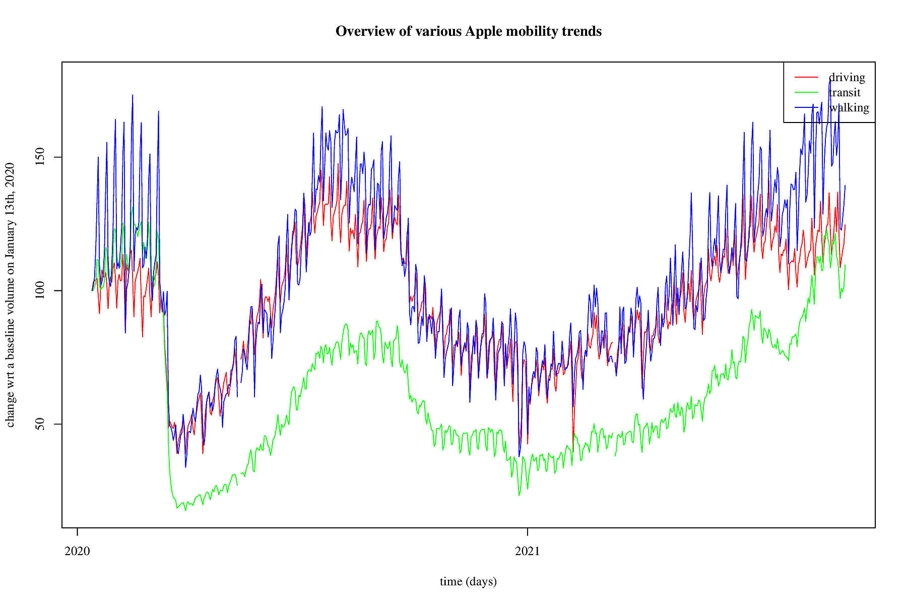
Also Apple measures mobility trends. In the figure this is shown.
Apple measures three trends: driving, transit and walking. so that
is a somewhat different kind of mobility. We take all three of
them into account.
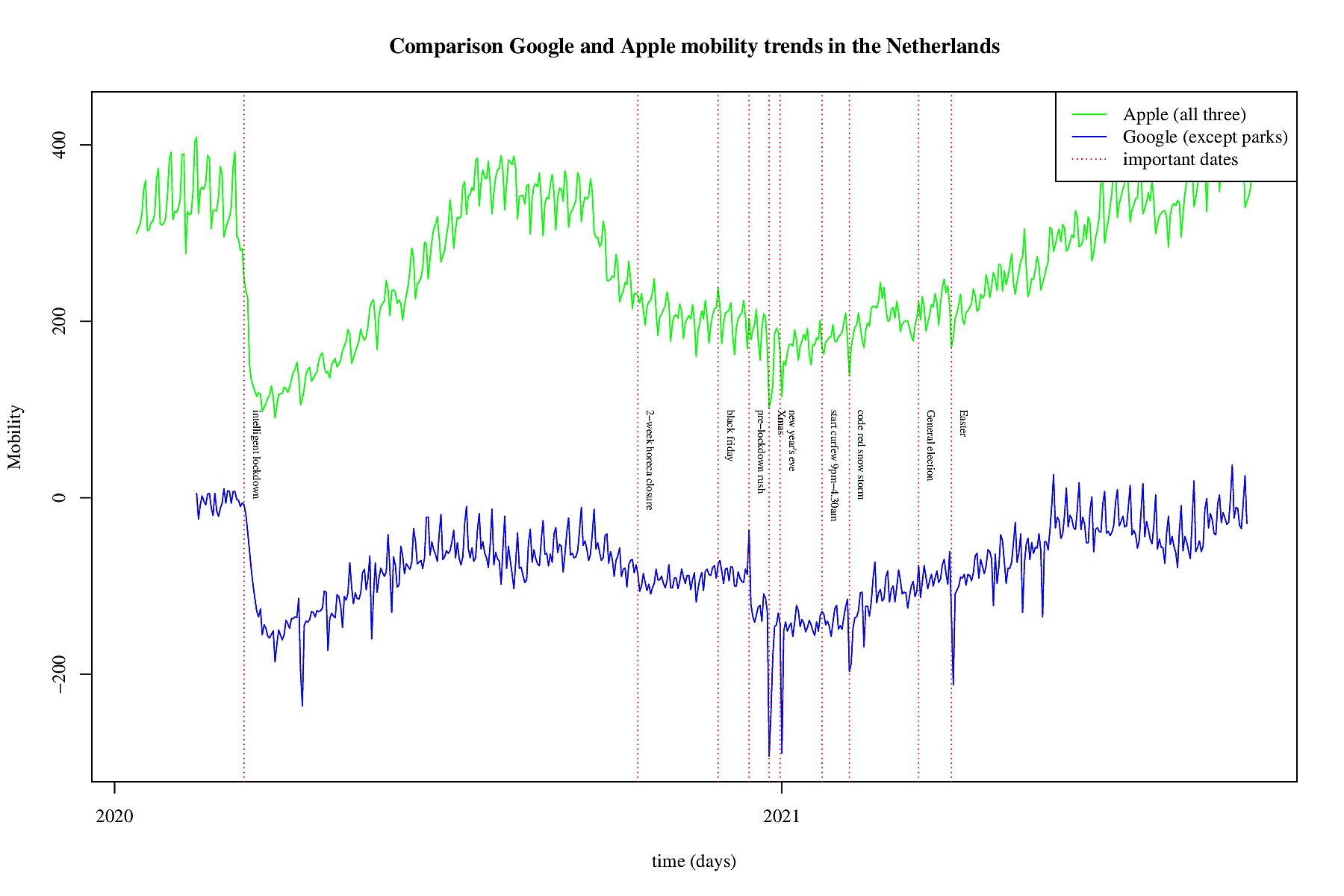
In the above figure is a comparison between the used Google mobility
and Apple's mobility trends. For Google the sum of all trends
except the parks is used and for Apple the sum of all three trends.
It is obvious that during the first wave, and the subsequent first
so-called intelligent lockdown in both cases the mobility dropped
very fast and very hard (see the first vertical red dotted line).
Afterwards the mobility trends crept up and after the summer the
infection rate increased as well. Meausers were taken and on
October, 14, 2020 2 weeks of extra measures were taken all restaurants
and cafes were closed. This to prevent the mobility and thus
infections to increase again. The infections kept rising and the
measures wre continued. Then black friday came, and from the
mobility trends there is no effect visible. So this might mean
that very day it was as mobile as black friday. Only on black
friday it was in the news. December 14, 2020 a hard lock down was
announced, and the day before a peak is visible in Google mobility.
The dotted red line is one day before the second lockdown. Google
seems to be a bit more accurate as it picked up the december 14
peak. Apple shows some steeper curves, and is more timely. So
they both have their pros and cons. We used them both but their
effect is similar.
Tail of daily Google mobility plus trend modelling

Tail of daily Apple mobility plus trend modelling

Tail of daily reproduction number plus trend modelling

Dependency analyses
In the long term we know that the SEIR models will show improvements and maybe it is best to model the latest data as a third wave. In the mean time it is insightful to know the short-term effects. To model short term effects it may be an idea to combine as much as possible information to make short-term forecasts.In brief, mobility seems to be correlated with the infection rate, and infections correlate with hospitalisation, and that correlates with ICU-hospitalisation. Of course, there is delay between too much mobility and its consequences. So, looking at this delayed potential effect, and the various rates being measures VAR models come to mind. For the uninitiated, Wikipedia summarizes it as follows: "Vector autoregression (VAR) is a statistical model used to capture the relationship between multiple quantities as they change over time. VAR is a type of stochastic process model. VAR models generalize the single-variable (univariate) autoregressive model by allowing for multivariate time series. VAR models are often used in economics and the natural sciences."
The univariate ARIMA family of models is already used the infection
rate. To obtain more insight in dependencies between the various
rates, the vector equivalent is now also used: the Vector Autor
Regression family of models. For, all the rates are in regression
with themselves somehow and they are related to one another somehow.
Only it is unknown how and why if only because it is impossible to
model human behaviour in case of a pandemic. In the best case the
VAR model provides for short-term forecasts that are somewhat
reliable. In order to obtain an idea of this supposed reliability
a large number of post-hoc analyses is carried out, to give some
credence to the ex-ante forecasts that the VAR family of models
provide for. In brief, a few VAR analyses are carried out and they
are animated below.
VAR model daily positive patients and Google mobility

VAR daily positively and hospitalized patients

VAR daily positively, hospitalized and ICU patients
In this VAR model all three rates are included: infections, hospitalisation and ICUs. Mobility trends are not taken into acocunt.
VAR daily positively, hospitalized, ICU patients and Google mobility
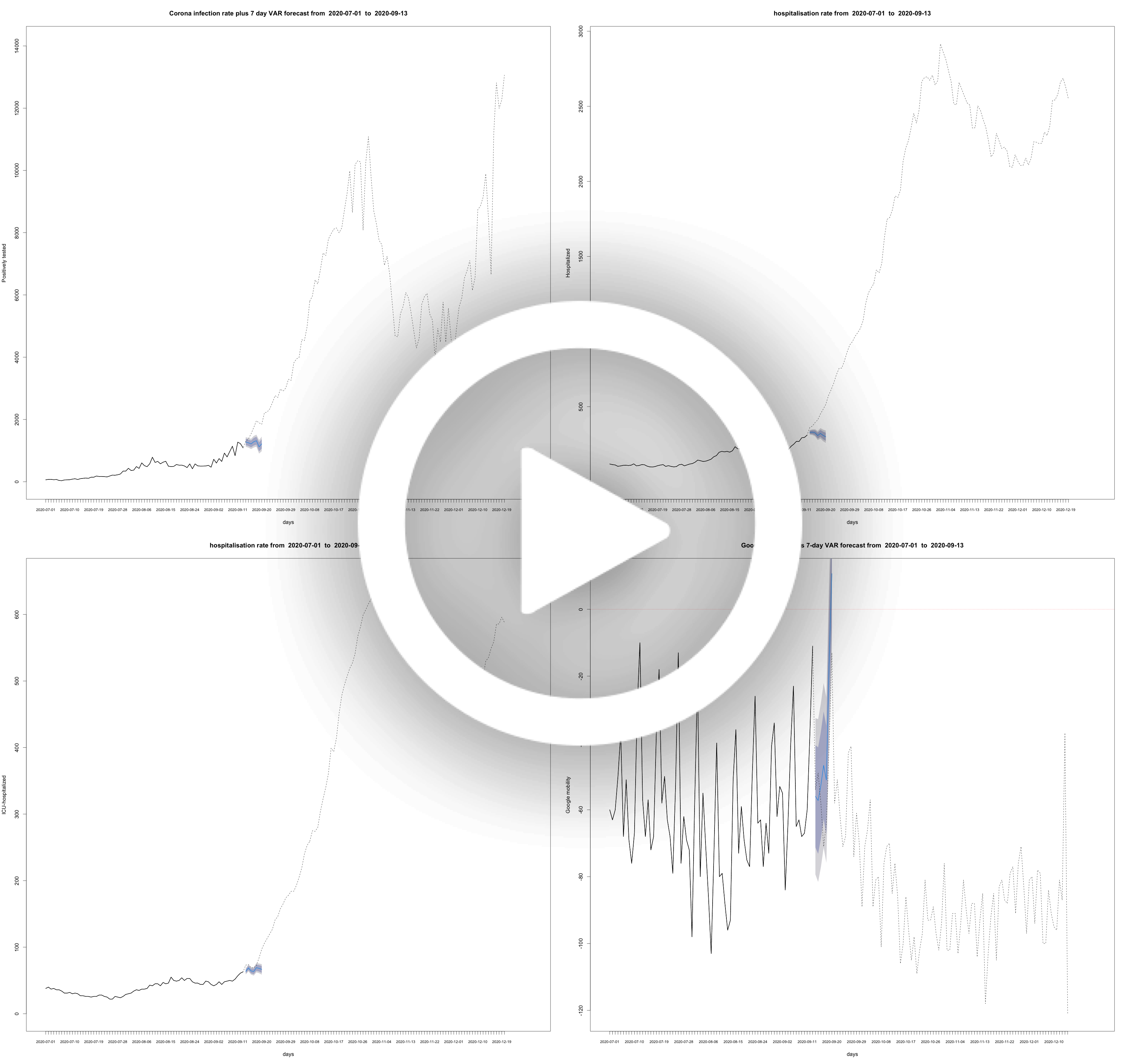
VAR model daily ICU patients and Google mobility

VAR model daily positive patients and Apple mobility

Daily rate of positively tested COVID-19 patients plus some models

VAR model daily ICU patients and Apple mobility

VAR model daily reproduction number and Google mobility

VAR model daily reproduction number and Apple mobility
The First Wave
Below the analyses of the first wave, with slightly other analyses due to the nature of the data back then. This part discusses the analyses carried out during the first wave. Ideally, you would want to look at rates, but some of the data is not smooth enough for fitting models on them. So instead of smoothing the rates, just apply the trick of cumulation. For the cumulative amounts we modeled them at first using exponential models, and once these began to systematically over estimate on the short term, we switched to the logistic growth curve.Development of COVID-19 in graphs
In the animations below, the black lines with the grey verticals represent the data, and the red line the model. The transparent red confidence bounds represent the uncertainty for the fit, not the uncertainty for the predictions. The next-day predictions are in blue. In the legend the percentage off the actual value, which is known for older models, is given.
data data model uncertainty for the fit next-day predictions
COVID-19 calculations, models, animations and predictions for the Netherlands
Tested positive per day (cumulative)

In this animation short and long term predictions are made for the cumulative amount of people positively tested. This is done with a logistic growth function that is common to use for restricted growth. As can be seen, from the asymptote that is moving up for recent dates, this reflects the changed testing policy in the Netherlands: the limit is projected higher and higher and that is because more and more people are tested.
Hospitalized patients per day (cumulative)

In this animation short and long term predictions are made for the cumulative amount of people hospitalized as a consequence of suffering from COVID-19. This is done with a logistic growth function that is common to use for restricted growth. As can be seen, from the asymptote that is not moving up that much for recent dates, this reflects the fact that less and less people are hospitalized in the Netherlands. This is due to two effects: general practitioners are having conversations with elderly people who are already suffering form other problems and the measures taken by the Dutch government.
ICU-hospitalized patients per day (cumulative)
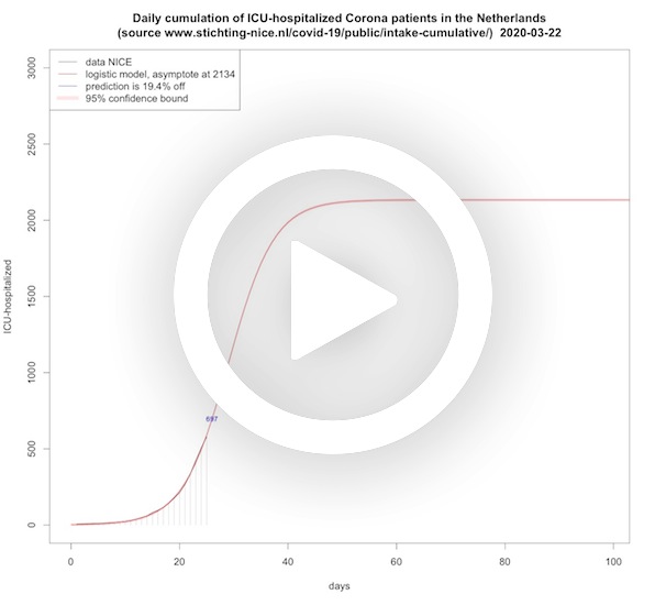
In this animation short and long term predictions are made for the cumulative amount of people that need ICU treatment as a consequence of severely suffering from COVID-19. This is done with a logistic growth function that is common to use for restricted growth. As can be seen, from the asymptote that is not moving up that much for recent dates, this reflects the fact that less and less people are hospitalized and therefore also less people will end up at the ICU.
Deceased per day (cumulative, logistic model)
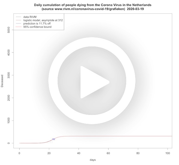
In this animation short and long term predictions are made for the cumulative amount of people dying from COVID-19. This is done with a logistic growth function that is common to use for restricted growth. As can be seen, from the asymptote that is initially moving up, this reflects that in the beginning the logistic model underestimates the end situation, and only recently the asymptote is a bit more stable. A logistic model has no knowledge about the underlying mechanics of the virus and its asymptote grows over time as the number of desceased grows over time. So it shows that more and more people die of COVID-19 as time progresses.
Deceased per day (cumulative, SEIR model)
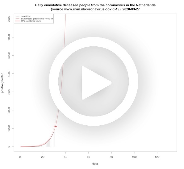
In this animation short and long term predictions are made for the cumulative amount of people dying from COVID-19. This time the cumulative deaths are fitted on a SEIR model where we fitted the cumulative deaths on the recovery differential equation. Where the logistic model's asymptote grows over time, the asymptote of the SEIR death rate is roughly lowering when time progresses. You might say that this reflects the effect of the lock down measures over time. It is in terms of asymptotes almost the opposite of the logistic model.
Deceased per day ICU (cumulative)
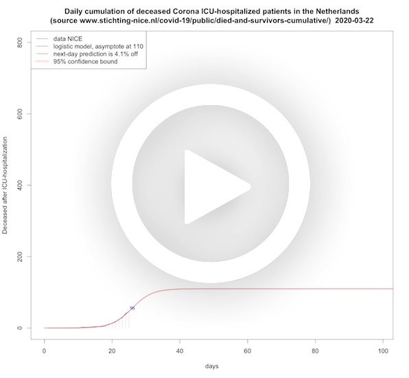
In this animation short and long term predictions are made for the cumulative amount of ICU-hospitalized patients dying from COVID-19. This is done with a logistic growth function that is common to use for restricted growth. Also here the asymptote is moving up, which reflects the delayed effect of the measures taken, and only recently the asymptote begins to stabilize.
Survivors per day ICU (cumulative)
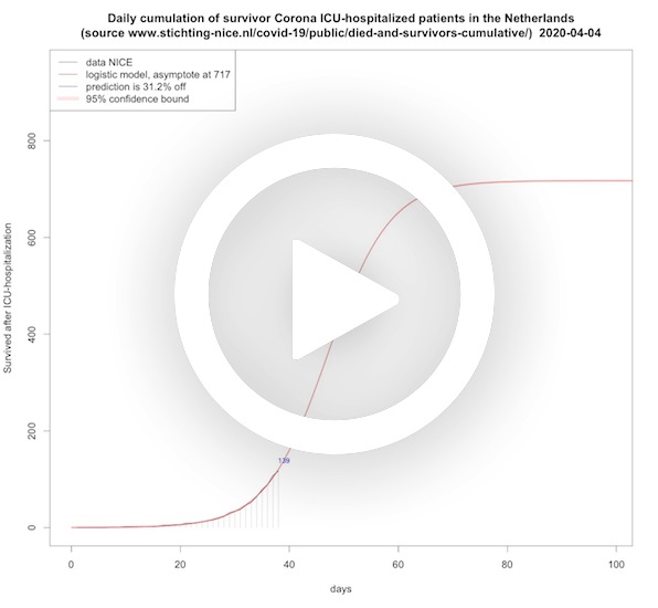
In this animation short and long term predictions are made for the cumulative amount of ICU-hospitalized COVID-19 patients leaving the hospital alive. This is done with a logistic growth function that is common to use for restricted growth. The asymptote is only recently moving up.
Hospitalized patients per day, including ICU (SEIR model)

In this animation the peak height and peak day plus short term predictions are made for the hospitalization rate (including ICU-beds) for COVID-19 patients in the Netherlands. This is done with a SEIR model that is common for this virus. Instead of trying to understand the decease dynamics – the coefficients for the differential equations, and the exact start values for the various rates – we just do a first guess and carry out a statistical minimisation procedure to find the coefficients and start values that fit with minimal error on the actual data. Each day when new information becomes available this procedure is reiterated, and each day it leads to a different model. This is not that strange: due to the measures taken the disease dynamics are influenced, and hence the coefficients of the SEIR model as well.
Hospitalized patients per day, including ICU (SEIRS model)

In this animation the SEIRS model is abused to see whether we can see a second wave coming. The hospitalization rate is stalling a bit since May 4, 2020. This may be nothing or some data collection artifact. So the SEIR model only knows one peak, which means you cannot model a second wave. But with a SEIRS model you can. Strictly you use that for recovered with temporal immunity, but we abuse it to fit a second wave, if any. Again, instead of trying to understand the decease dynamics – the coefficients for the differential equations, and the exact start values for the various rates – we just do a first guess and carry out a statistical minimisation procedure to find the coefficients and start values that fit with minimal error on the actual data. This model fits better than the SEIR model when the decline is stalling, but before that the SEIR model fits better and its extrapolation further in time, too, which is useful. It is included just to see whether the long term prediction of a stalling hospitalization rate is going to be persistent or not.
ICU-hospitalized patients per day (SEIR model)
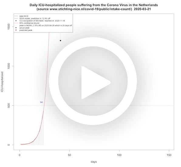
In this animation the peak height and peak day, next-day predictions and when the threshold for 750, 700 and now 500 ICU-beds are reached are presented for ICU-beds for COVID-19 patients in the Netherlands. As before, this is done with a SEIR model that is common for this virus. The peak height and peak top were crucial because of the limitations in the Netherlands. On March 25, 2020, the media reported that the peak would be end of May, and the height would then be 2200 ICU-beds. From the model that was fitted for that day, this seemed highly unlikely. The next days, the SEIR models also did not show any sign of this reported peak time or height.
Accuracy antibody test on positive result

In this animation we see the chance that you have actually had COVID-19 – under the condition that a certain serology test gives a positive outcome. This was discussed in the Dutch talk show Jinek on April 1, 2020.
☞ Read the stand-alone article or check out the English translation.
Other
-
RIVM data extracted from their website
dring the first wave, it seemed to be a bit of a problem for some to extract the data from the RIVM site, but for the second wave some JSON file is doing the job. For convenience here’s their latest data, no guarantees :-)
-
NICE data extracted from their website
The NICE data is much better organized and can be slurped in directly in JSON format. For convenience here’s their latest data, again no guarantees :-)
-
Acknowledgements
Thanks to Mark Meuwese for the web design.