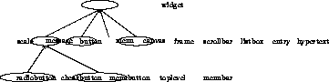
Appendix: The hush widget classes


intro Tcl/Tk programs handler actions to events widgets graphics appendix
[-<--%--^-->-] The hush widget class library encapsulates the standard Tk widgets. In addition, a hypertext widget is offered. The widget classes are organized as a tree, with the class widget at the root.

slide: Widget classes

Each concrete widget class offers the functionality supported by the (abstract) widget class and may in addition define functions specific to the particular widget class. The member function for a widget class have usually a straightforward correspondence with the command interface defined by the Tcl/Tk toolkit. See Ousterhout94 for the most recent description. Each widget class specifies two constructors, one with only a path and one which allows both for a widget and a path. In the latter case, the actual path consists of the concatenation of the path of the widget and the path specified by the string parameter. For the concrete widget classes, no widget will be created when the options parameter is zero. This convention is adopted to allow composite widgets to inherit from the standard widgets, yet define their own components. In addition, each widget class has a destructor, which is omitted for brevity. The destructor may be used to reclaim the storage for a widget object. To remove a widget from the screen, the function widget::destroy must be used.

The scale class

The scale widget may be used to obtain numerical input from the user.
    interface scale : widget { 
  
      scale(char* p, char* options = "");
      scale(widget* w, char* p, char* options = "");
  
      void text(char* s);                        // text to display
      void from(int n);                          // begin value
      void to(int n);                            // end value
      int get();                                 // gets the value
      void set(int v);                           // sets the value
  
    protected:
      install(binding*, char* args);
    };
  

slide: The scale class

When a handler is attached to a scale it is called when the user releases the slider. The value of the scale is passed as an additional parameter when the handler is invoked. The default binding for the scale is the ButtonRelease event.

The message class

The message widget may be used to display a message on the screen.
    interface message : widget { 
  
      message(char* p, char* options = "" );
      message(widget* w, char* p, char* options = "" );
      
      void text(char* s);                               // the text
    };
  

slide: The message class

The message class does not define default bindings, but the user is free to associate events to a message widget by employing widget::bind.

The button class

Buttons come in a number of varieties, such as ordinary (push) buttons, that simply invoke an action, checkbuttons, that toggle between an on and off state, and radiobuttons, that may be used to constrain buttons to allow the selection of only a single alternative. Checkbuttons and radiobuttons are implemented as subclasses of the class button, and will not be further discussed here.
    interface button : widget { 
  
      button(char* p, char* options = "");
      button(widget* w, char* p, char* options = "");
      
      void text(char* s);                    // text to display
      void bitmap(char* s);                  // to display a bitmap
      
      void state(char *s);            // to change the buttons state
      
      void flash();
      char* invoke();
  
    protected:
      install(binding*,char* args);           // default binding
    };
  

slide: The button class

In addition to the constructors, which have the same format for each widget class, the button class offers the function text to define the text displayed by the button and the function bitmap, which takes as argument the name of a file containing a bitmap, to have a bitmap displayed instead. The function state may be used to change the state of the button. Legal arguments are either normal, active or disabled. Further, the button class defines the function flash and invoke that result respectively in flashing the button and in invoking the action associated with the button by means of the widget::handler function. (Note that button::install is defined, albeit protected.)

The menubutton class

The menubutton is a specialization of the button widget. It allows for attaching a menu that will be displayed when pressing the button.
    interface menubutton : button { 
      
      menubutton(char* p, char* options = "");
      menubutton(widget* w, char* p, char* options = "");
      
      void menu(char* s);                    // to attach a menu
      void menu(class menu* m);
    };
  

slide: The menubutton class

The menubutton must be used to pack menus in a menubar.

The menu class

A menu consists of a number of button-like entries, each associated with an action. A menu entry may also consist of another menu, that pops up whenever the entry is selected.
    interface menu : widget { 
      
      menu(char* p, char* options = "");
      menu(widget* w, char* p, char* options = "");
      
      menu* add(char* s, char* options = "");
      
      menu* entry(char* s, char* args ="", char* options="");
      menu* entry(char* s, binding* ac, char* args="", char* opts="");
      
      menu* cascade(char* s, char* m, char* options = "");
      menu* cascade(char* s, menu* m, char* options = "");
      
      char* entryconfigure(int i, char* options);
      
      int index(char *s);
      int active();                    // returns active index
      
      void del(int i);                 // delete entry with index i
      void del(char* s);               // delete entry with tag s 
      
      char* invoke(int i);             // invoke entry with index i
      char* invoke(char *s );          // invoke entry with tag s
      
      void post(int x = 500, int y = 500); 
      void unpost();
  
    protected:
      install(binding*, char* args);
    };
  

slide: The menu class

The add function is included to allow arbitrary entries (as defined by Tk) to be added. We restrict ourselves to simple command and cascade entries. The entry function (that is used for adding simple command entries) may explicitly be given a binding to be associated with the entry. Alternatively, if no binding is specified, the default handler binding installed by invoking widget::bind will be used. The string used as a label for the entries (the first parameter of entry) will be given as a parameter to the action invoked when selecting the entry. The string given in the args parameter will be added to the actual parameters for the action invoked. The cascade function may either be given a menu or a string, containing the pathname of the menu. In any case the cascaded menu must be a child of the original menu. The function index returns the integer index associated with the string describing the entry. The function active may be used to inquire which entry has been selected. Entries may be deleted using the function del and invoked by using invoke. For both functions, the entry may be indicated by its numerical index or a string. Menus are toplevel widgets, they are mapped to the screen either by invoking the function post, or by pressing the menubutton to which the menu is attached.

The canvas class

Apart from the two standard constructors, it offers the functions tag, tags and move that merely repeat the functions offered by the item class, except that move may also be given a tag to identify the items to be moved.
    interface canvas : widget { 
  
      canvas(char *p, char* options="");
      canvas(widget* w, char *p, char* options="");
      
      void tag(int id, char* tag);
      char* tags(int id);
      
      void move(int id, int x, int y);
      void move(char* id, int x, int y);
      
      item bitmap(int x1, int y1, char* bitmap, char* options="");
      item line(int x1, int y1, int x2, int y2, char* options="");
      item line(char* linespec, char* options="");
      item circle(int x1, int y1, int rad, char* options="");
      item oval(int x1, int y1, int x2, int y2, char* options="");
      item polygon(char* linespec, char* options="");
      item rectangle(int x1, int y1, int x2, int y2, char* options="");
      item text(int x1, int y1, char* txt, char* options=""); 
      item window(int x1, int y1, char* win, char* options="");
      item window(int x1, int y1, widget* win, char* options="");
      
      item current();
      item overlapping(int x, int y);
      
      itemconfigure(int it, char* options);
      itemconfigure(char* tag, char* options);
      itembind(int it, char* s, binding* a, char* args = "" );
      itembind(char* tag, char* s, binding* a, char* args = "" );
      
      void postscript(char* file, char* options="");
  
    protected:
      install(binding*, char* args);
    };
  

slide: The canvas class

Currently, the graphic items bitmap, line, oval, polygon and rectangle may created and, in addition, text items and window items consisting of a widget. The function overlapping may be used to retrieve the item overlapping a particular position. In addition, the canvas class offers auxiliary functions needed to support the functionality provided by the item class. The canvas may be written as Postscript to a file with the function canvas::postscript.

The frame class

Frame widgets may used to combine widgets. A frame has no functionality or bindings of its own.
    interface frame : widget { 
      
      frame(char* p, char * options = "");
      frame(widget* w, char* p, char * options = "");
    };
  

slide: The frame class

The frame widget class has the toplevel and menubar as subclasses. The toplevel widget is used when the widget must be independently mapped to the screen. The menubar widget is used as a special frame to collect button widgets including menubutton widgets.

The scrollbar class

The scrollbar allows the user to scroll through widgets that are only partly displayed.
    interface scrollbar : widget { 
  
      scrollbar(char* p, char* options = "");
      scrollbar(widget* w, char* p, char* options = "");
  
      void orient(char* opts="vertical");   // orientation
      xview(widget* w);                     // widget to scroll
      yview(widget* w);                     // widget to scroll
    };
  

slide: The scrollbar class

The default orientation of a scrollbar is vertical. A scrollbar must be explicitly attached to a widget w by calling the scrollbar::yview functions for vertical scrollbars and scrollbar::xview for horizontal scrollbars. To obtain the proper geometrical layout, the scrollbar and the widget it controls must usually be packed in a frame.

The listbox class

The listbox widget is used to allow the user to select an item from a list of alternatives.
    interface listbox : widget { 
      
      listbox(char* p, char* options = "");
      listbox(widget* w, char* p, char* options = "");
      
      void insert(char* s);
      char* get(int d);             // entry with index d
      
      void singleselect();
  
    protected:
      install(binding*, char* args);
    };
  

slide: The listbox class

The listbox may be filled by using insert. When a handler is attached to the widget, it is activated when the user double clicks on an item. The selected entry is passed as an additional parameter to the handler. The entry may also be obtained by either kit::selection or listbox::get.

The entry class

An entry widget may be used to display text or allow the user to type a short text.
    interface entry : widget { 
  
      entry(char* p, char* options = "");
      entry(widget* w,char* p, char* options = "");
      
      void insert(char* s);                    // insert text
      char* get();                         // to get the text
  
    protected:
      install(binding*, char* args);
    };
  

slide: The entry class

When a handler is attached to the entry widget it is activated whenever the user double clicks on the widget or presses the return key. The contents of the entry are added as an argument when calling the handler.

The hypertext class

The hypertext widget may be used to display text with embedded Tcl code.
    interface hypertext : widget {
  
      hypertext(char* p, char* options = "");
      hypertext(widget* w, char* p, char* options = "");
      
      void file(char* f);         // to read in hypertext file
    };
  

slide: The hypertext class

Apart from the standard constructors, it offers the function file to read in a hypertext file. Such a hypertext file allows to embed widgets in the text by inserting them in escape sequences.
intro Tcl/Tk programs handler actions to events widgets graphics appendix