Example -- drawtool
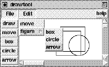
Our drawing tool consists of a tablet, which is a canvas with scrollbars to allow for a large size canvas of which only a part is displayed, a menu_bar, having a File and an Edit menu, and a toolbox, which is a collection of buttons for selecting among the drawing facilities. See figure Drawtool. In addition, a help facility is offered. The application class for drawtool is defined as follows:
    class application : public session {
    public:
      application(int argc, char* argv[])
  				: session(argc,argv,"drawtool") {}

      void main() {
        widget* root = tk->root();
        frame* f = new frame(root,".frame");

        tablet* c = new tablet(f);                 // create tablet

        toolbox* b = new toolbox(f,c);
        menubar* m = new menu_bar(root,c,b);

        b->pack("-side left");                       // pack tablet
        c->pack("-side right");

        tk->pack(m)->pack(f);                // pack menu and frame
      }
    };
Configuring widgets
Widgets are the elements a GUI is made of. They appear as windows on the screen to display text or graphics and may respond to events such as motioning the mouse or pressing a key by calling an action associated with that event. Most often, the various widgets constituting the user interface are (hierarchically) related to each other, as for instance in the drawtool application which contains a canvas to display graphic elements, a button toolbox for selecting the graphic items and a menubar offering various options such as saving the drawing in a file.Pathnames
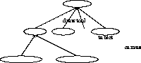
Widgets in Tk are identified by a pathname. The pathname of a widget reflects its possible subordination to another widget. See figure Hierarchy.path ::= . | .string | path.stringwhere string and path are nonterminals. For example "." is the pathname of the root widget, whereas ".quit" is the pathname of a child of the root widget. A widget that is a child of another widget must have the pathname of its parent as part of its own path name. For example, the widget ".f.m" may have a widget ".f.m.h" as a child widget. Note that the widget hierarchy induced by the pathnames is completely orthogonal to the widget class inheritance hierarchy depicted in figures Widgets and Classes. Pathnames are treated somewhat more liberally in hush. For example, widget pathnames may simply be defined or extended by a string. The missing dot is then automatically inserted.
The widget class
When creating a widget, a pathname must be given to
the widget constructor. Pathnames may be defined relative
to a parent widget.
The class interface of widget is given below:
    interface widget : handler {

      widget(char* p);
      widget(widget& w, char* p);

      char* type();                // returns type of the widget
      char* path();                // returns path of the widget

      int eval(char* cmd);         // invokes "thepath() cmd"
      char* result();              // returns the result of eval
      char* evaluate(char* cmd);   // combines eval and result()

      virtual void configure(char* cmd);  // invokes Tk configure
      virtual void geometry(int w, int h); // determines w x h

      widget* pack(char* options = "" ); // maps it to the screen

      bind(char *b, handler* h, char* args = "" );  // binding

      bind(handler* h, char* args = "" );           // implicit

      void xscroll(scrollbar* s);        // to attach scrollbars
      void yscroll(scrollbar* s);

      void focus(char* options="");
      void grab(char* options="");

      void destroy();             // to remove it from the screen

      void* tkwin();  // gives access to Tk_Window implementation

      widget* self();            // for constructing mega widgets
      void redirect(widget* w);

    protected:
      char* thepath();                // delivers the virtual path
      void alias( widget* );          // to create widget command
      virtual install(binding*,char* args="");  // default bindings
      virtual direct(char* bnd, binding*, char* args=""); // effect
    };
slide: The widget interface
widget* w = new widget(".awry");
does not result in creating an actual
widget but only defines a pointer to the widget
with that particular name.
If a widget with that name exists, it may be treated
as an ordinary widget object, otherwise an error will occur.
The constructor widget(widget* w,char* path) creates
a widget by appending the pathname path to the
pathname of the argument widget w.
The function path delivers the pathname of
a widget object.
Each widget created by Tk actually defines a
Tcl command associated with the
pathname of the widget.
In other words, an actual widget may be regarded
as an object which can be asked to evaluate commands.
For example a widget ".b" may be asked to change
its background color by a Tcl command like
.b configure -background blue
The functions eval, result and evaluate
enable the programmer to apply Tcl commands
to the widget directly, as does the configure
command.
The function geometry sets the width and height of
the widget.
Packing
Naming widgets in a hierarchical fashion does not imply
that the widgets behave accordingly.
In particular, to position widgets properly,
they must be packed in relation
to one another.
Packing results in displaying the widgets on the screen.
The widget class interface offers two
pack functions.
The function widget::pack(char*)
applies to individual widgets.
As options one may specify for example
-side X, where X is either
top, bottom, left
or right,
to pack the widget to the appropriate side
of the cavity specified by the ancestor widget.
Other options are -fill x or
-fill y, to fill up the space
in the appropriate dimensions
or -padx N or -pady N, for
some integer N,
to surround the widget with some extra space.
As a remark, the kit::pack function may only
be used to pack widgets to the root window.
Binding events
Widgets may respond to events.
To associate an event with an action,
an explicit binding must be specified
for that particular widget.
Some widgets provide default bindings.
These may, however, be overruled.
The function bind is used to associate
handlers or bindings with events.
The first string parameter of
bind may be used to specify
the event type.
Common event types are,
for example,
ButtonPress, ButtonRelease
and Motion, which are the
default events for canvas widgets.
Also keystrokes may be defined as events,
as for example Return,
which is the default event for
the entry widget.
The function widget::bind(handler*, char*) may be
used to associate a handler object
or
action with the default bindings
for the widget.
Concrete widgets may not override the handler
function itself, but must define the protected
virtual function install.
Typically, the install function consists
of calls to bind
for each of the event types that is
relevant to the widget.
Bindings are effected by the virtual function
direct that may be redefined to effect
the binding for multiple widgets, for example.
For both the bind
functions, the optional args
parameter may be used to specify
the arguments that will be passed
to the handler or action
when it is invoked.
For the button widget for example,
the default install function supplies
the text of the button as an additional
argument for its handler.
Compound widgets
In addition, the widget class offers four
functions that may be used
when defining compound or mega widgets.
The function call redirect(w) must by used
to delegate the invocation
of the eval, configure,
bind and handler functions
to the widget w.
The function self() gives access to the widget
to which the commands are redirected.
After invoking redirect,
the function thepath will deliver
the path that is determined by self()->path().
In contrast, the function path will still deliver
the pathname of the outer widget.
Calling redirect when creating the compound widget
class suffices for most situations.
However, when the default events must be changed or the
declaration
of a handler must take effect for several component widgets,
the virtual function install must be redefined
to handle the delegation explicitly.
The alias function is needed when creating
widgets that are also used in Tcl scripts.
It creates the command corresponding to the
widget's path name.
How redirect and alias actually work will
hopefully become clear in the examples.
Buttons
As the first component of the drawing tool,
we will look at the toolbox.
The toolbox is a collection of buttons
packed in a frame:
>
    class toolbutton : public button {       // the toolbutton
    public:
      toolbutton(widget* w, char* name) : button(w,name) {
          text(name);
  	bind(w,name);    // the parent becomes the handler
  	pack();
      }
    };

    class toolbox : public frame {               // the toolbox
    public:
      toolbox(widget* w, tablet* t) : c(t), frame(w,"toolbox") {
          button* b0 = new toolbutton(this,"draw");
          button* b1 = new toolbutton(this,"move");
          button* b2 = new toolbutton(this,"box");
          button* b3 = new toolbutton(this,"circle");
          button* b4 = new toolbutton(this,"arrow");
      }

      int operator()() {
  		c->mode( _event->arg(1) );     // transfer to tablet
  		return OK;
  		}
    private:
      tablet* c;
    };
slide: The toolbutton class
Comments
The definition of the toolbutton and toolbox
illustrates that a widget need not necessarily be its
own handler.
The decision whether to define a subclass which is made
its own handler or
to install an external handler
depends on what is considered the most convenient
way to access the resources needed.
As a guideline, exploit the regularity of the application!
Menus
The second component of our drawing tool is the menu_bar:
    class menu_bar : public menubar {          // row of menubuttons
    public:
      menu_bar(widget* w, tablet* t, toolbox* b) : menubar(w,"bar") {
        configure("-relief sunken");

        menubutton* b1 = new file_menu(this,t);
        menubutton* b2 = new edit_menu(this,b);
        button* b3 = new help_button(this);
      }
    };
slide: Our menubar class
    class file_menu : public menubutton {

    public:
      file_menu(widget* w, tablet* t) : c(t), menubutton(w,"file") {

        configure("-relief sunken"); text("File"); pack("-side left");

        f = new file_handler(c);   // create a file_handler

        class menu* m = new class menu(this,"menu");
        this->menu(m);             // declares it for the menubutton
        m->bind(this);             // installs this as the handler

        m->entry("Open");
        m->entry("Save");
        m->entry("Quit");
      }

      int operator()() {

    	if (!strcmp( _event->arg(1),"Quit")) tk->quit();
    	else f->dispatch( _event ); // transfer to file_handler
    	return OK;
      }

    protected:
      tablet* c;
      file_handler* f;
    };
slide: The file_menu class
Defining actions -- delegation versus inheritance
The most important component of our drawtool
application is defined by the tablet class:
class drawmode { // drawing modes
public: enum { draw, move, box, circle, arrow, lastmode };
};
class tablet : public canvas { // the tablet
public:
tablet(widget* w, char* options="");
int operator()() { // according to _mode
return handlers [ mode] ->dispatch( _event );
}
void mode(char* m); // to set the drawing mode
protected:
void init(char* options); // initializes the tablet
int _mode;
class handler* handlers[drawmode::lastmode]; // keeps modes
canvas* c; // the actual canvas
};
slide: The tablet class
Dispatching
Although the tablet must act as a canvas,
the actual tablet widget is nothing but a frame
that contains a canvas widget as one of its components.
This is reflected in the definition of the
tablet constructor and the way it invokes
the canvas constructor.
>
    tablet::tablet(widget* w, char* options) : canvas(w,"tablet",0) {
      widget* top = new frame(path());

      init(options);                          // inialization, layout
      redirect(c);                            // redirect to canvas
      bind(this);                             // this is the handler

      handlers[drawmode::draw] = new draw_handler(this);
      handlers[drawmode::move] = new move_handler(this);
      handlers[drawmode::box] = new box_handler(this);
      handlers[drawmode::circle] = new circle_handler(this);
      handlers[drawmode::arrow] = new arrow_handler(this);
      _mode = drawmode::draw;
    }
slide: The tablet constructor
Creating new widgets
Having taken care of the basic components
of the drawing tool, that is the toolbox,
menu_bar and tablet widgets, all that remains
to be done is to define
a suitable file_handler,
appropriate handlers for the
various drawing modes
and a help_handler.
This will be done in sections
Dialogs,
Canvas and
Hypertext,
respectively.
However, before that we will look at how to define
the drawtool widget class such that we may also declare
a corresponding drawtool script command.
The actual declaration of the drawtool command
is done in the application class defined below,
which will by now look familiar, except for the function
prelude:
    class application : public session {
    public:
      application(int argc, char* argv[])
  				: session(argc,argv,"drawtool") {}

      void prelude( ) {
      	tk->bind("drawtool", new drawtool());    // declare
      }

      void main( kit* tk, int, char* argv[] ) {
      	drawtool* d = new drawtool(".draw");
      	tk->bind("drawtool",d);                // override
      	d->pack();
      }
    };
In the body of the prelude function,
the Tcl command drawtool is declared,
with an instance of drawtool as its handler.
In this way, the drawtool widget
is made available as a command when
the program is used as an interpreter.
However, in the function main
this declaration is overridden.
Instead, the actual drawtool widget
is made the handler of the command,
in order to allow for a script to
address the drawtool by calling
drawtool self, as will be explained later.
Since an instance of drawtool may also be used as
simply a handler for the drawtool command,
the drawtool class must offer
a constructor that creates no widget,
in addition to a constructor that does create a drawtool
widget:
    class drawtool : public canvas {
    public:
      drawtool() : canvas() {  }                        // no widget
      drawtool(char* p, char* opts="") : canvas(p,0) {
  	top = new frame(path(),"-class Drawtool");  // outer frame
      	init(opts);
      	redirect(c);                      // redirect to tablet
  	alias( top );              // to declare widget command
      }

      // Define the semantics of the drawtool command

      int operator()(){
      	if (!strcmp("self",argv[1]) )                     // self
  			   tk->result(self()->path());
      	else if ( !strcmp( "drawtool" ,*argv) )           // create
  			   create(--argc,++argv);
      	else                                              // eval
  			   self()->eval( flatten(--argc,++argv) );
      	return OK;
      }

    protected:
      wiget* top;                                      // outer frame
      tablet* c;                                   // inner component

      void init(char* options);

      // To create a new drawtool widget and corresponding command

      void create(int argc, char* argv[]) {
        char* name = *argv;
        new drawtool(name, flatten(--argc,++argv));
      }
    };
slide: The drawtool class
    set x [drawtool self]
    \$x create rectangle 100 20 160 80
    \$x create rectangle 90 30 150 90
    \$x create oval 120 40 170 90
Evaluating the script results in the drawing
displayed in figure Drawtool.
Such a script may be read in
by using the Open option in the File
menu (see section Dialogs).
If neither of these cases apply,
the function widget::eval is invoked
for self(), with the remaining arguments flattened
to a string.
This makes it possible to
use the drawtool almost as an ordinary
canvas as illustrated above and
in the example hypertext script shown in
section
Hypertext.
The creation of the actual widget and
declaration of the corresponding Tcl command,
according to the Tk convention,
is somewhat more involved.
Recall that each Tk widget is identified by
its path, which simultaneously
defines a command that may be used
to configure the widget or,
as for a canvas,
to draw figures on the screen.
Hence, the function create must
create a new widget and declare the widget
to be the handler of the command
corresponding to its pathname.
Discussion
By now you may have lost track of
how delegation within a compound
widget takes place.
Hopefully, a brief look at the implementation
will clarify this.
Each eval, configure or bind
function call for a widget
results in a command addressed at
the path of the widget.
By redirecting the command to a different path,
the instructions may be delegated to
the appropriate (component) widget.
Delegation occurs, in other words,
by directing the commands to the widget's virtual
path, which is obtained by the protected
function thepath().
In contrast, the function path() delivers
the path of the widget's outer component.
Indirection takes place by invoking the function
self(), which relies on an instance variable
_self that may be set by the redirect
function.
slide: Dereferencing self()
    char* thepath() { return self()->path(); }
    widget* self() { return _self?_self->self():this; }
Hence, resolving a compound widget's
primary inner component relies on simple pointer chasing,
which may be applied recursively to an
arbitrary depth at acceptable costs.
Dialogs
Interactive applications may require
the user to type some input
after reading a message or
to select an item from a list
of alternatives.
One of the widgets that may be used in a dialog
with the user is a file_chooser
widget as depicted in figure
Filechooser.
slide: A filechoose
    class file_chooser : public toplevel {              // toplevel

      file_chooser() : toplevel( gensym("filechooser") ) { init(); }

      int operator()();
      char* get() { return e->get(); }

    protected:
      button* b; button *c;                          // OK and CANCEL
      entry* e; listbox* l;
      int install(char* s, binding* a, char* opts);
      void init();
      void list();
    };
The file_chooser widget consists
of a listbox filled with filenames
and an entry widget that contains
the filename selected by
the user (by double clicking on the name)
or which may, alternatively,
be used to type in a filename directly.
In addition, the file_chooser
has an OK button, to confirm the choice
and a CANCEL button, to break off
the dialog.
Typically, a file_chooser
is a toplevel widget, that is a widget that
is independently mapped to the screen.
To avoid name clashes the function gensym,
which delivers a system-wide unique
name (with filechooser as a prefix),
is used to determine its path.
Apart from the operator() function,
the file_chooser has only
one public function get,
which delivers the name selected or
typed in by the user.
The widget components of the
file_chooser, two buttons and
the
entry and
listbox widgets,
are stored in its instance variables.
Further, we have a function init
to construct the actual file_chooser
widget, a function list to fill
the listbox and the function install,
which is used to install an external handler
for the two button widgets.
The install function is defined as
  void file_chooser::install(binding* a, char* args) {
   	b->handler(a,args);
    	c->handler(a,args);
  }
Recall, that when declaring a handler for
a button, the name of the button is given
as an additional argument when invoking the handler.
This enables the file_handler
to distinguish between a call due
to pressing the OK button and a call
due to pressing the CANCEL button.
The interplay between the C++ definition
and the underlying Tcl/Tk toolkit is nicely
illustrated by the definition of the list function.
void file_chooser::list() {
sprintf(buf,"foreach i [glob *.tcl] { %s insert end
Calling list results in filling the
listbox with the filenames in the
current directory.
Its corresponding definition in C++
would, no doubt, be much more involved.
The file_handler class
Window-based interactive applications differ from
ordinary interactive applications
by relying on an event-driven flow of control.
The indirection that is typical for
event-driven control is exemplified
in the definition of the
file_handler depicted below
(recall that the file_handler
was employed by the file_menu
described in section Menus):
>
    class file_handler : public handler {
    public:
      file_handler( canvas* x ) : c(x) {}

      int operator()() {
  	char* key = _event->arg(1);
      	if (!strcmp("Open", key)) launch("OPEN");
      	else if (!strcmp("Save", key)) launch("SAVE");
      	else if (!strcmp("OPEN", key)) open();
      	else if (!strcmp("SAVE", key)) save();
      	return OK;
      }

    protected:
      canvas* c;
      file_chooser* f;

      void launch(char* args) {       // launch new filechooser
      	f = new file_chooser();
      	f->handler(this, args);
      }

      void open() { tk->source( f->get() ); f->destroy(); }
      void save() { c->postscript( f->get() ); f->destroy(); }
    };
slide: The file_handler class
intro
Tcl/Tk
programs
handler actions to events
widgets
graphics
appendix
interface widget : handler {
widget(char* p);
widget(widget& w, char* p);
char* type(); // returns type of the widget
char* path(); // returns path of the widget
int eval(char* cmd); // invokes "thepath() cmd"
char* result(); // returns the result of eval
char* evaluate(char* cmd); // combines eval and result()
virtual void configure(char* cmd); // invokes Tk configure
virtual void geometry(int w, int h); // determines w x h
widget* pack(char* options = "" ); // maps it to the screen
bind(char *b, handler* h, char* args = "" ); // binding
bind(handler* h, char* args = "" ); // implicit
void xscroll(scrollbar* s); // to attach scrollbars
void yscroll(scrollbar* s);
void focus(char* options="");
void grab(char* options="");
void destroy(); // to remove it from the screen
void* tkwin(); // gives access to Tk_Window implementation
widget* self(); // for constructing mega widgets
void redirect(widget* w);
protected:
char* thepath(); // delivers the virtual path
void alias( widget* ); // to create widget command
virtual install(binding*,char* args=""); // default bindings
virtual direct(char* bnd, binding*, char* args=""); // effect
};
widget* w = new widget(".awry");
does not result in creating an actual
widget but only defines a pointer to the widget
with that particular name.
If a widget with that name exists, it may be treated
as an ordinary widget object, otherwise an error will occur.
The constructor widget(widget* w,char* path) creates
a widget by appending the pathname path to the
pathname of the argument widget w.
The function path delivers the pathname of
a widget object.
Each widget created by Tk actually defines a
Tcl command associated with the
pathname of the widget.
In other words, an actual widget may be regarded
as an object which can be asked to evaluate commands.
For example a widget ".b" may be asked to change
its background color by a Tcl command like
.b configure -background blueThe functions eval, result and evaluate enable the programmer to apply Tcl commands to the widget directly, as does the configure command. The function geometry sets the width and height of the widget.
Packing
Naming widgets in a hierarchical fashion does not imply that the widgets behave accordingly. In particular, to position widgets properly, they must be packed in relation to one another. Packing results in displaying the widgets on the screen. The widget class interface offers two pack functions. The function widget::pack(char*) applies to individual widgets. As options one may specify for example -side X, where X is either top, bottom, left or right, to pack the widget to the appropriate side of the cavity specified by the ancestor widget. Other options are -fill x or -fill y, to fill up the space in the appropriate dimensions or -padx N or -pady N, for some integer N, to surround the widget with some extra space. As a remark, the kit::pack function may only be used to pack widgets to the root window.Binding events
Widgets may respond to events. To associate an event with an action, an explicit binding must be specified for that particular widget. Some widgets provide default bindings. These may, however, be overruled. The function bind is used to associate handlers or bindings with events. The first string parameter of bind may be used to specify the event type. Common event types are, for example, ButtonPress, ButtonRelease and Motion, which are the default events for canvas widgets. Also keystrokes may be defined as events, as for example Return, which is the default event for the entry widget. The function widget::bind(handler*, char*) may be used to associate a handler object or action with the default bindings for the widget. Concrete widgets may not override the handler function itself, but must define the protected virtual function install. Typically, the install function consists of calls to bind for each of the event types that is relevant to the widget. Bindings are effected by the virtual function direct that may be redefined to effect the binding for multiple widgets, for example. For both the bind functions, the optional args parameter may be used to specify the arguments that will be passed to the handler or action when it is invoked. For the button widget for example, the default install function supplies the text of the button as an additional argument for its handler.Compound widgets
In addition, the widget class offers four functions that may be used when defining compound or mega widgets. The function call redirect(w) must by used to delegate the invocation of the eval, configure, bind and handler functions to the widget w. The function self() gives access to the widget to which the commands are redirected. After invoking redirect, the function thepath will deliver the path that is determined byself()->path().
In contrast, the function path will still deliver
the pathname of the outer widget.
Calling redirect when creating the compound widget
class suffices for most situations.
However, when the default events must be changed or the
declaration
of a handler must take effect for several component widgets,
the virtual function install must be redefined
to handle the delegation explicitly.
The alias function is needed when creating
widgets that are also used in Tcl scripts.
It creates the command corresponding to the
widget's path name.
How redirect and alias actually work will
hopefully become clear in the examples.
Buttons
As the first component of the drawing tool, we will look at the toolbox. The toolbox is a collection of buttons packed in a frame:
class toolbutton : public button { // the toolbutton
public:
toolbutton(widget* w, char* name) : button(w,name) {
text(name);
bind(w,name); // the parent becomes the handler
pack();
}
};
class toolbox : public frame { // the toolbox
public:
toolbox(widget* w, tablet* t) : c(t), frame(w,"toolbox") {
button* b0 = new toolbutton(this,"draw");
button* b1 = new toolbutton(this,"move");
button* b2 = new toolbutton(this,"box");
button* b3 = new toolbutton(this,"circle");
button* b4 = new toolbutton(this,"arrow");
}
int operator()() {
c->mode( _event->arg(1) ); // transfer to tablet
return OK;
}
private:
tablet* c;
};
Comments
The definition of the toolbutton and toolbox illustrates that a widget need not necessarily be its own handler. The decision whether to define a subclass which is made its own handler or to install an external handler depends on what is considered the most convenient way to access the resources needed. As a guideline, exploit the regularity of the application!Menus
The second component of our drawing tool is the menu_bar:
class menu_bar : public menubar { // row of menubuttons
public:
menu_bar(widget* w, tablet* t, toolbox* b) : menubar(w,"bar") {
configure("-relief sunken");
menubutton* b1 = new file_menu(this,t);
menubutton* b2 = new edit_menu(this,b);
button* b3 = new help_button(this);
}
};
class file_menu : public menubutton {
public:
file_menu(widget* w, tablet* t) : c(t), menubutton(w,"file") {
configure("-relief sunken"); text("File"); pack("-side left");
f = new file_handler(c); // create a file_handler
class menu* m = new class menu(this,"menu");
this->menu(m); // declares it for the menubutton
m->bind(this); // installs this as the handler
m->entry("Open");
m->entry("Save");
m->entry("Quit");
}
int operator()() {
if (!strcmp( _event->arg(1),"Quit")) tk->quit();
else f->dispatch( _event ); // transfer to file_handler
return OK;
}
protected:
tablet* c;
file_handler* f;
};
Defining actions -- delegation versus inheritance
The most important component of our drawtool application is defined by the tablet class:
class drawmode { // drawing modes
public: enum { draw, move, box, circle, arrow, lastmode };
};
class tablet : public canvas { // the tablet
public:
tablet(widget* w, char* options="");
int operator()() { // according to _mode
return handlers [ mode] ->dispatch( _event );
}
void mode(char* m); // to set the drawing mode
protected:
void init(char* options); // initializes the tablet
int _mode;
class handler* handlers[drawmode::lastmode]; // keeps modes
canvas* c; // the actual canvas
};
Dispatching
Although the tablet must act as a canvas, the actual tablet widget is nothing but a frame that contains a canvas widget as one of its components. This is reflected in the definition of the tablet constructor and the way it invokes the canvas constructor.
tablet::tablet(widget* w, char* options) : canvas(w,"tablet",0) {
widget* top = new frame(path());
init(options); // inialization, layout
redirect(c); // redirect to canvas
bind(this); // this is the handler
handlers[drawmode::draw] = new draw_handler(this);
handlers[drawmode::move] = new move_handler(this);
handlers[drawmode::box] = new box_handler(this);
handlers[drawmode::circle] = new circle_handler(this);
handlers[drawmode::arrow] = new arrow_handler(this);
_mode = drawmode::draw;
}
Creating new widgets
Having taken care of the basic components of the drawing tool, that is the toolbox, menu_bar and tablet widgets, all that remains to be done is to define a suitable file_handler, appropriate handlers for the various drawing modes and a help_handler. This will be done in sections Dialogs, Canvas and Hypertext, respectively. However, before that we will look at how to define the drawtool widget class such that we may also declare a corresponding drawtool script command. The actual declaration of the drawtool command is done in the application class defined below, which will by now look familiar, except for the function prelude:
class application : public session {
public:
application(int argc, char* argv[])
: session(argc,argv,"drawtool") {}
void prelude( ) {
tk->bind("drawtool", new drawtool()); // declare
}
void main( kit* tk, int, char* argv[] ) {
drawtool* d = new drawtool(".draw");
tk->bind("drawtool",d); // override
d->pack();
}
};
In the body of the prelude function,
the Tcl command drawtool is declared,
with an instance of drawtool as its handler.
In this way, the drawtool widget
is made available as a command when
the program is used as an interpreter.
However, in the function main
this declaration is overridden.
Instead, the actual drawtool widget
is made the handler of the command,
in order to allow for a script to
address the drawtool by calling
drawtool self, as will be explained later.
Since an instance of drawtool may also be used as simply a handler for the drawtool command, the drawtool class must offer a constructor that creates no widget, in addition to a constructor that does create a drawtool widget:
class drawtool : public canvas {
public:
drawtool() : canvas() { } // no widget
drawtool(char* p, char* opts="") : canvas(p,0) {
top = new frame(path(),"-class Drawtool"); // outer frame
init(opts);
redirect(c); // redirect to tablet
alias( top ); // to declare widget command
}
// Define the semantics of the drawtool command
int operator()(){
if (!strcmp("self",argv[1]) ) // self
tk->result(self()->path());
else if ( !strcmp( "drawtool" ,*argv) ) // create
create(--argc,++argv);
else // eval
self()->eval( flatten(--argc,++argv) );
return OK;
}
protected:
wiget* top; // outer frame
tablet* c; // inner component
void init(char* options);
// To create a new drawtool widget and corresponding command
void create(int argc, char* argv[]) {
char* name = *argv;
new drawtool(name, flatten(--argc,++argv));
}
};
set x [drawtool self]
\$x create rectangle 100 20 160 80
\$x create rectangle 90 30 150 90
\$x create oval 120 40 170 90
Evaluating the script results in the drawing
displayed in figure Drawtool.
Such a script may be read in
by using the Open option in the File
menu (see section Dialogs).
If neither of these cases apply, the function widget::eval is invoked for self(), with the remaining arguments flattened to a string. This makes it possible to use the drawtool almost as an ordinary canvas as illustrated above and in the example hypertext script shown in section Hypertext. The creation of the actual widget and declaration of the corresponding Tcl command, according to the Tk convention, is somewhat more involved. Recall that each Tk widget is identified by its path, which simultaneously defines a command that may be used to configure the widget or, as for a canvas, to draw figures on the screen. Hence, the function create must create a new widget and declare the widget to be the handler of the command corresponding to its pathname.
Discussion
By now you may have lost track of how delegation within a compound widget takes place. Hopefully, a brief look at the implementation will clarify this. Each eval, configure or bind function call for a widget results in a command addressed at the path of the widget. By redirecting the command to a different path, the instructions may be delegated to the appropriate (component) widget. Delegation occurs, in other words, by directing the commands to the widget's virtual path, which is obtained by the protected function thepath(). In contrast, the function path() delivers the path of the widget's outer component. Indirection takes place by invoking the function self(), which relies on an instance variable _self that may be set by the redirect function.
char* thepath() { return self()->path(); }
widget* self() { return _self?_self->self():this; }
Hence, resolving a compound widget's
primary inner component relies on simple pointer chasing,
which may be applied recursively to an
arbitrary depth at acceptable costs.
Dialogs
Interactive applications may require the user to type some input after reading a message or to select an item from a list of alternatives. One of the widgets that may be used in a dialog with the user is a file_chooser widget as depicted in figure Filechooser.
class file_chooser : public toplevel { // toplevel
file_chooser() : toplevel( gensym("filechooser") ) { init(); }
int operator()();
char* get() { return e->get(); }
protected:
button* b; button *c; // OK and CANCEL
entry* e; listbox* l;
int install(char* s, binding* a, char* opts);
void init();
void list();
};
The file_chooser widget consists
of a listbox filled with filenames
and an entry widget that contains
the filename selected by
the user (by double clicking on the name)
or which may, alternatively,
be used to type in a filename directly.
In addition, the file_chooser
has an OK button, to confirm the choice
and a CANCEL button, to break off
the dialog.
Typically, a file_chooser
is a toplevel widget, that is a widget that
is independently mapped to the screen.
To avoid name clashes the function gensym,
which delivers a system-wide unique
name (with filechooser as a prefix),
is used to determine its path.
Apart from the operator() function,
the file_chooser has only
one public function get,
which delivers the name selected or
typed in by the user.
The widget components of the
file_chooser, two buttons and
the
entry and
listbox widgets,
are stored in its instance variables.
Further, we have a function init
to construct the actual file_chooser
widget, a function list to fill
the listbox and the function install,
which is used to install an external handler
for the two button widgets.
The install function is defined as
void file_chooser::install(binding* a, char* args) {
b->handler(a,args);
c->handler(a,args);
}
Recall, that when declaring a handler for
a button, the name of the button is given
as an additional argument when invoking the handler.
This enables the file_handler
to distinguish between a call due
to pressing the OK button and a call
due to pressing the CANCEL button.
The interplay between the C++ definition
and the underlying Tcl/Tk toolkit is nicely
illustrated by the definition of the list function.
void file_chooser::list() {
sprintf(buf,"foreach i [glob *.tcl] { %s insert end
Calling list results in filling the
listbox with the filenames in the
current directory.
Its corresponding definition in C++
would, no doubt, be much more involved.
The file_handler class
Window-based interactive applications differ from ordinary interactive applications by relying on an event-driven flow of control. The indirection that is typical for event-driven control is exemplified in the definition of the file_handler depicted below (recall that the file_handler was employed by the file_menu described in section Menus):
class file_handler : public handler {
public:
file_handler( canvas* x ) : c(x) {}
int operator()() {
char* key = _event->arg(1);
if (!strcmp("Open", key)) launch("OPEN");
else if (!strcmp("Save", key)) launch("SAVE");
else if (!strcmp("OPEN", key)) open();
else if (!strcmp("SAVE", key)) save();
return OK;
}
protected:
canvas* c;
file_chooser* f;
void launch(char* args) { // launch new filechooser
f = new file_chooser();
f->handler(this, args);
}
void open() { tk->source( f->get() ); f->destroy(); }
void save() { c->postscript( f->get() ); f->destroy(); }
};
intro Tcl/Tk programs handler actions to events widgets graphics appendix